
Personal Challenge
DailyUI Challenge
04Type
Personal Challenge
Role
UI Designer
Year
2024 - 2025
Platform
Mobile + Web
100 consecutive days of UI design. Each morning: a prompt. Each evening: a finished screen. No briefs, no clients, no safety net. Just a designer deciding what to make, how to make it, and why it should exist.
The challenge pushed me past surface-level aesthetics into the harder questions: what makes a screen feel trustworthy, what makes a flow feel inevitable, and what happens when you design something every single day without anyone waiting for it.
0
Days of Design
0+
Featured Projects
0
Platforms
0
Design Stages Each
Challenge
Designing every day without a safety net
I started the DailyUI Challenge to build a habit that client work couldn't give me: uninterrupted creative freedom. No stakeholders, no scope creep, no approval cycles. Just a prompt, Figma, and whatever I could make before the day ended. As someone who defaults to over-thinking, designing under self-imposed time constraints was genuinely uncomfortable at first and that discomfort was the point.
What Made It Hard
No brief: every constraint had to come from me
Designing in public as a natural introvert
Maintaining visual quality under daily time pressure
Avoiding stylistic repetition across 100 prompts
Knowing when to simplify vs. when to go further
What I Was Building
A consistent daily design habit from scratch
Confidence in sharing unpolished-in-progress work
Range across categories: apps, web, games, error pages
Visual language and personal design instincts
A portfolio of work that proved I could execute fast
"I am quite an introvert, so sharing my work publicly was a challenge in itself. But it turned out to be one of the most important things I did."Sofiia Kukhar on the DailyUI Challenge
Process
The same three stages, every day.
Prompt Analysis
Reading the brief, identifying design constraints, and researching relevant patterns. Every prompt is a different product type - the first ten minutes determines whether I'd design something generic or something considered.
Ideation + Wireframing
Sketching layout directions quickly before touching Figma. Keeping options open until one clearly outperformed the others in terms of visual interest and logical structure.
Visual Refinement
Colour palette, type system, and imagery selected for consistency with each mini-brand. Final screens refined against design principles: contrast ratios, visual weight, and reading flow always checked before closing the file.
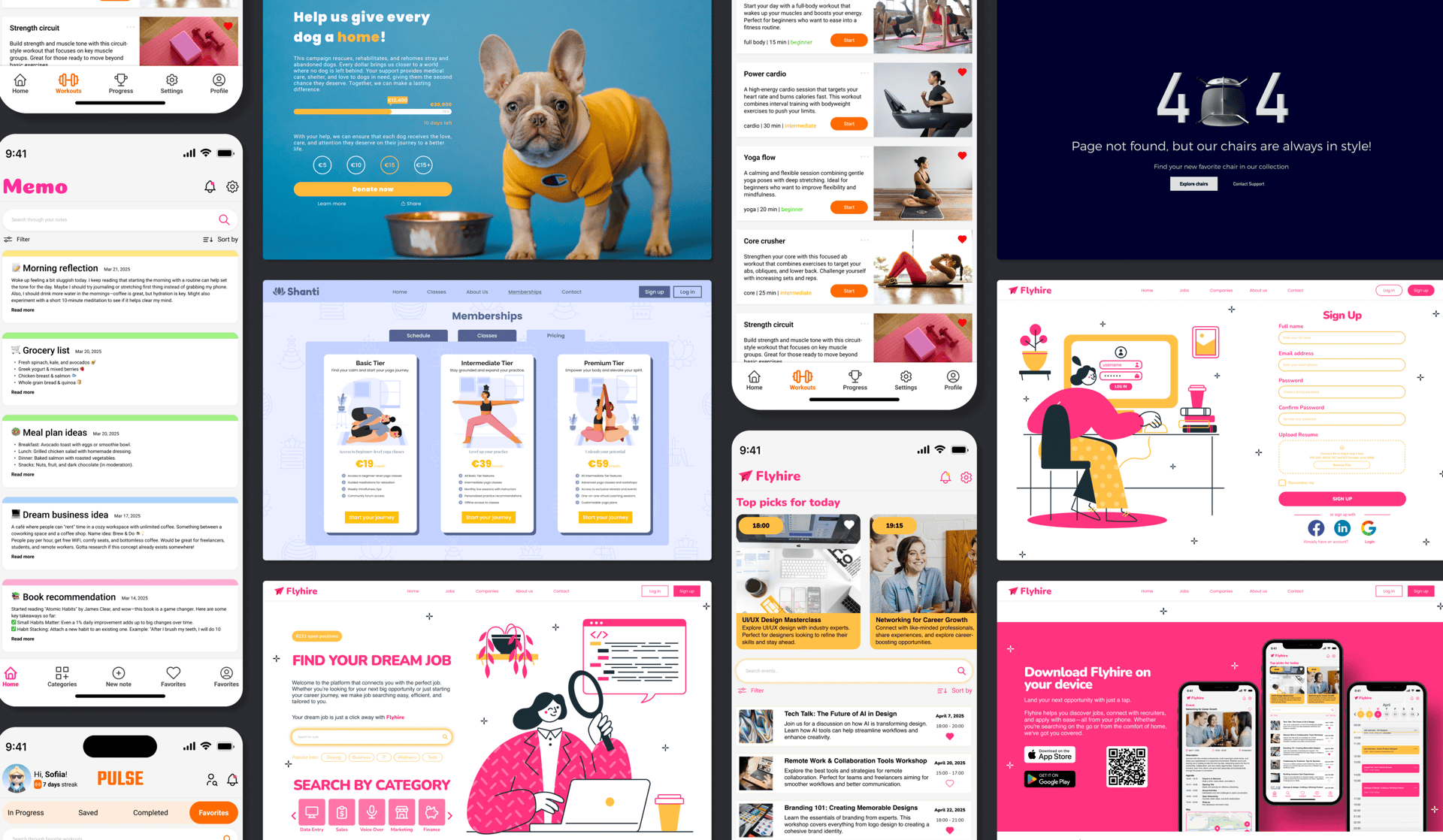
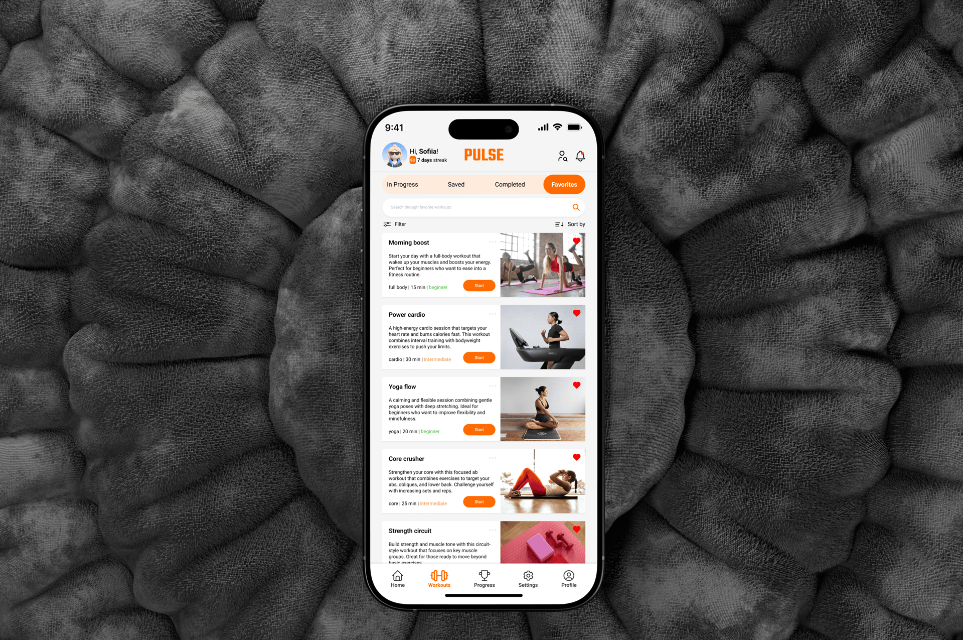
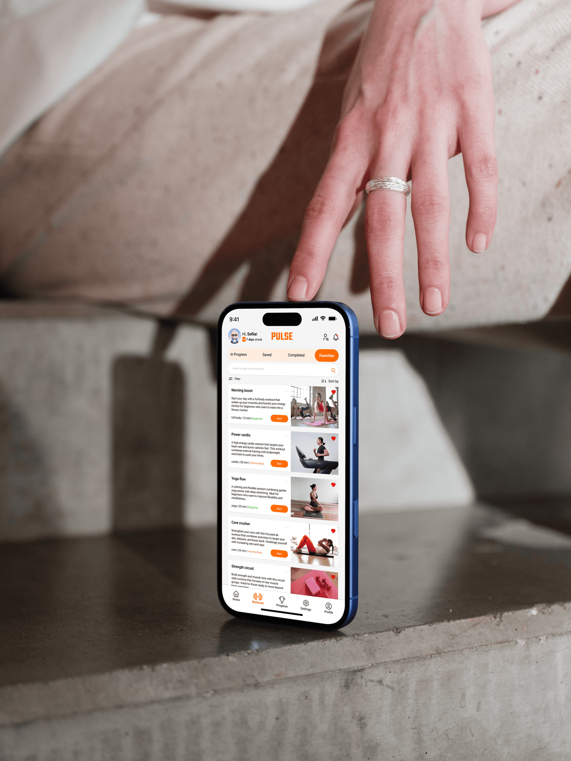
Day 044 - Favorites Screen
Pulse
Workout App
A favorites screen for a workout app built to solve a real friction point: users who already know what works for them should never have to search. Pulse organises saved workouts by category with quick-access filters, a motivation streak indicator, and dense but scannable workout cards. The challenge was balancing information density with visual calm in a context where users are often short on time.
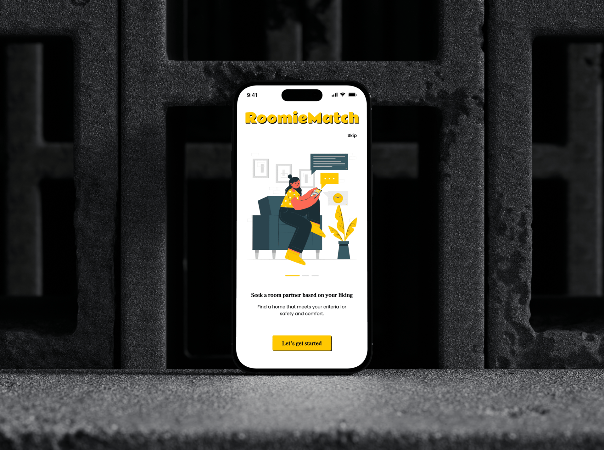
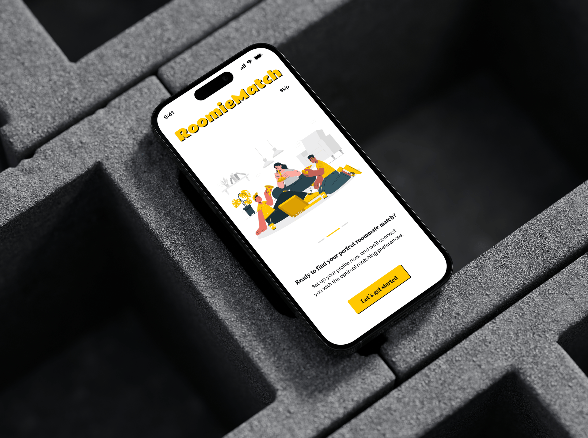
Onboarding Flow
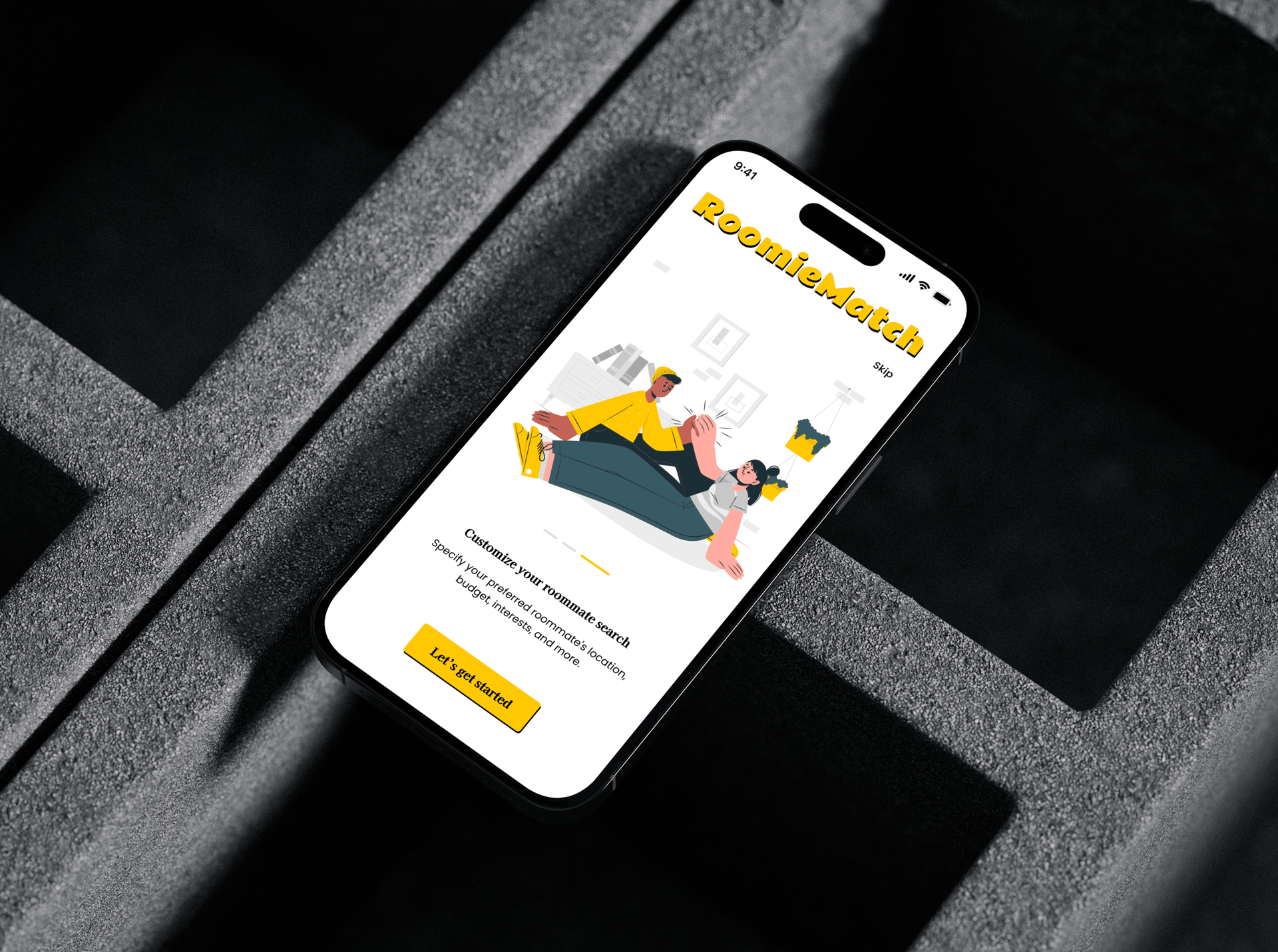
Roomie Match
Roommate-Finding App
An onboarding flow for a roommate-finding app designed to build confidence, not just collect data. Most onboarding flows feel like form-filling. Roomie Match was designed to feel like a conversation: progressive disclosure reveals features one at a time, a visual progress indicator removes the sense of an endless process, and playful icons maintain warmth in what is otherwise a logistically anxious experience. The goal was to get users to their first match with as little friction as possible.
Fundraising Page
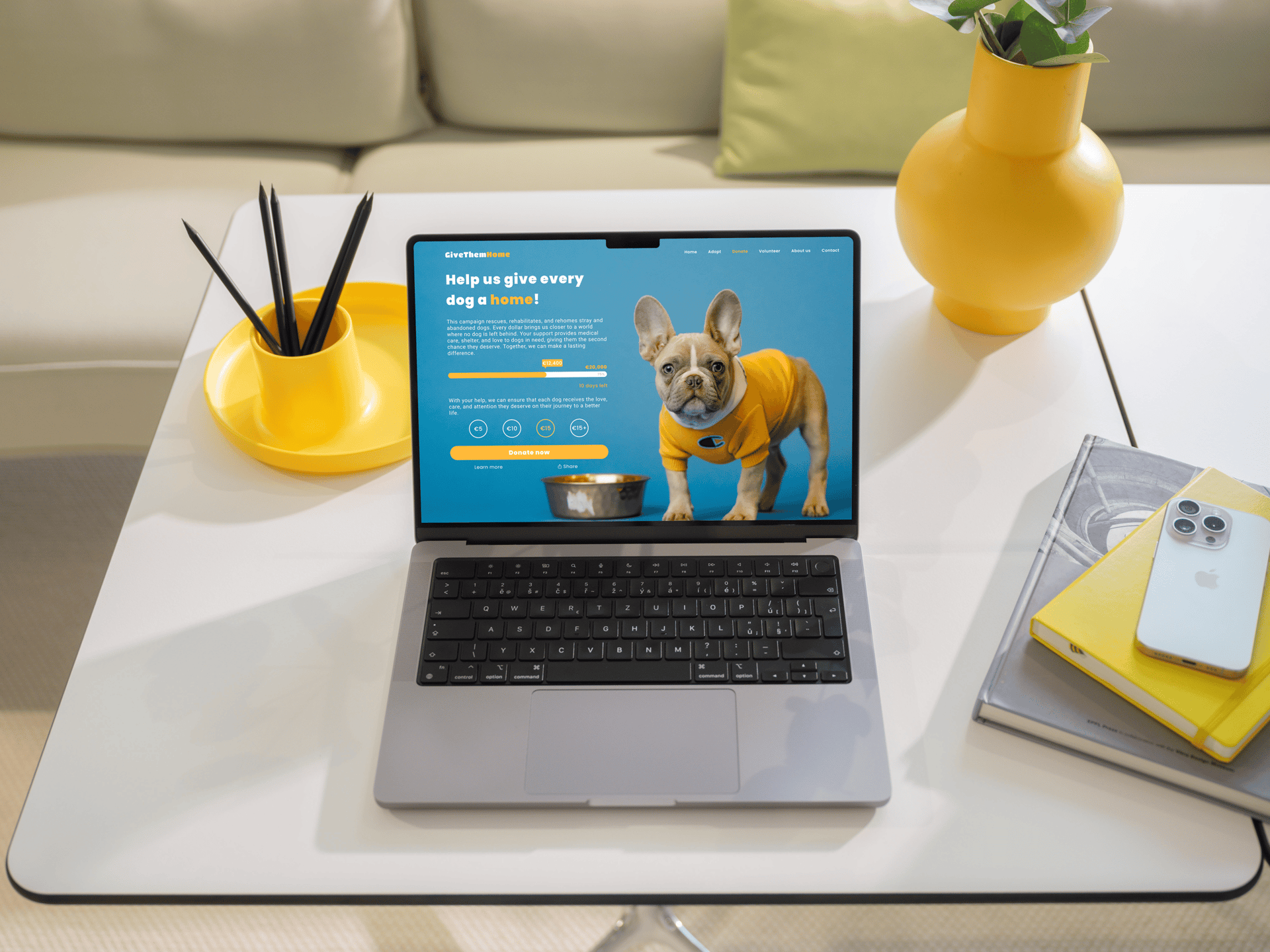
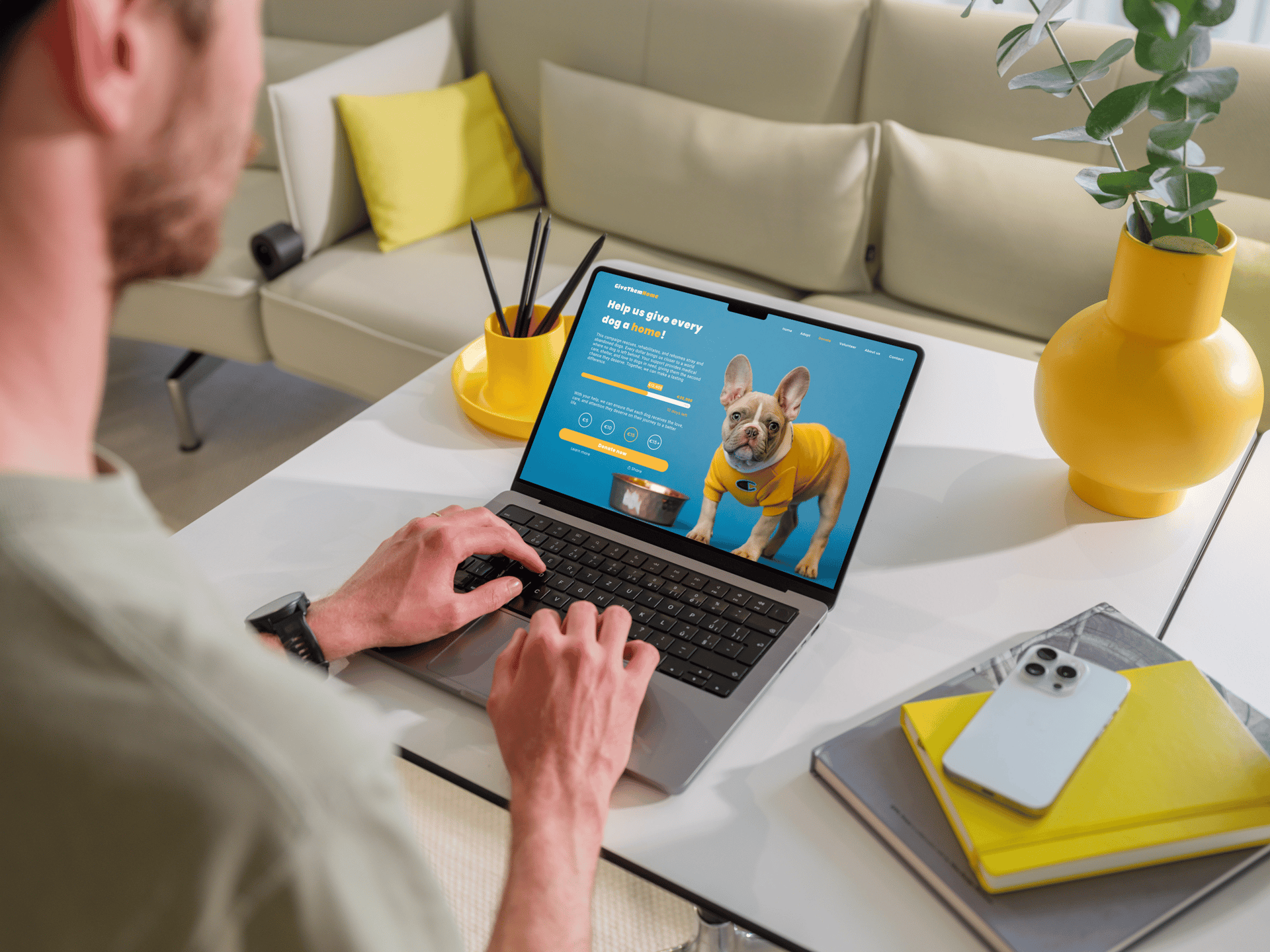
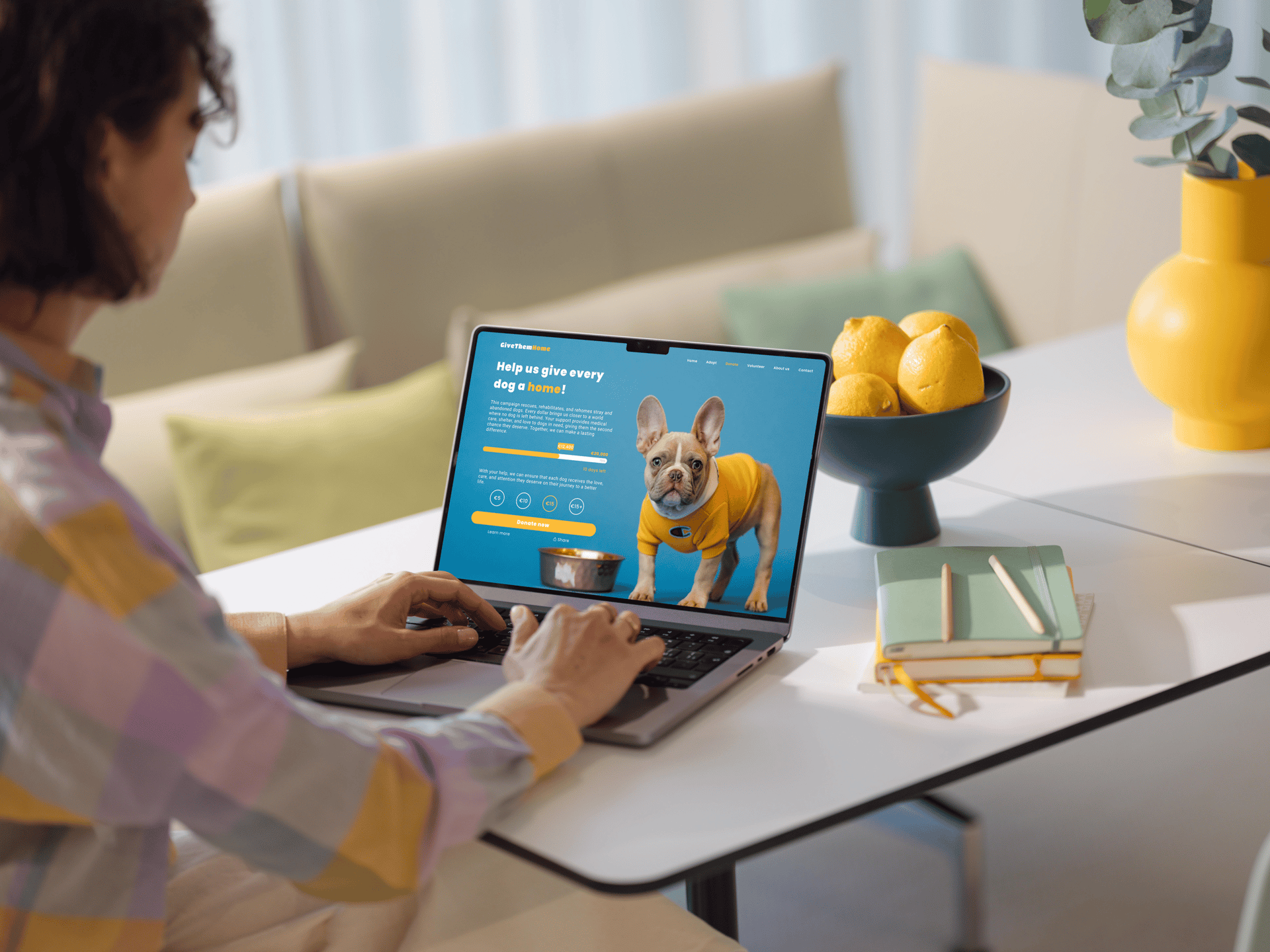
Crowdfunding
Animal Shelter Donation Page
A donation page for an animal shelter, where the design challenge was emotional: how do you motivate action without guilt? The page leads with warmth through photography and copy, then removes barriers with a clear goal visualisation, a countdown timer, and suggested donation amounts. Every element is oriented toward a single moment of decision. Progress bar placement, button hierarchy, and emotional image selection were all deliberate responses to the abandonment patterns common in fundraising UX.
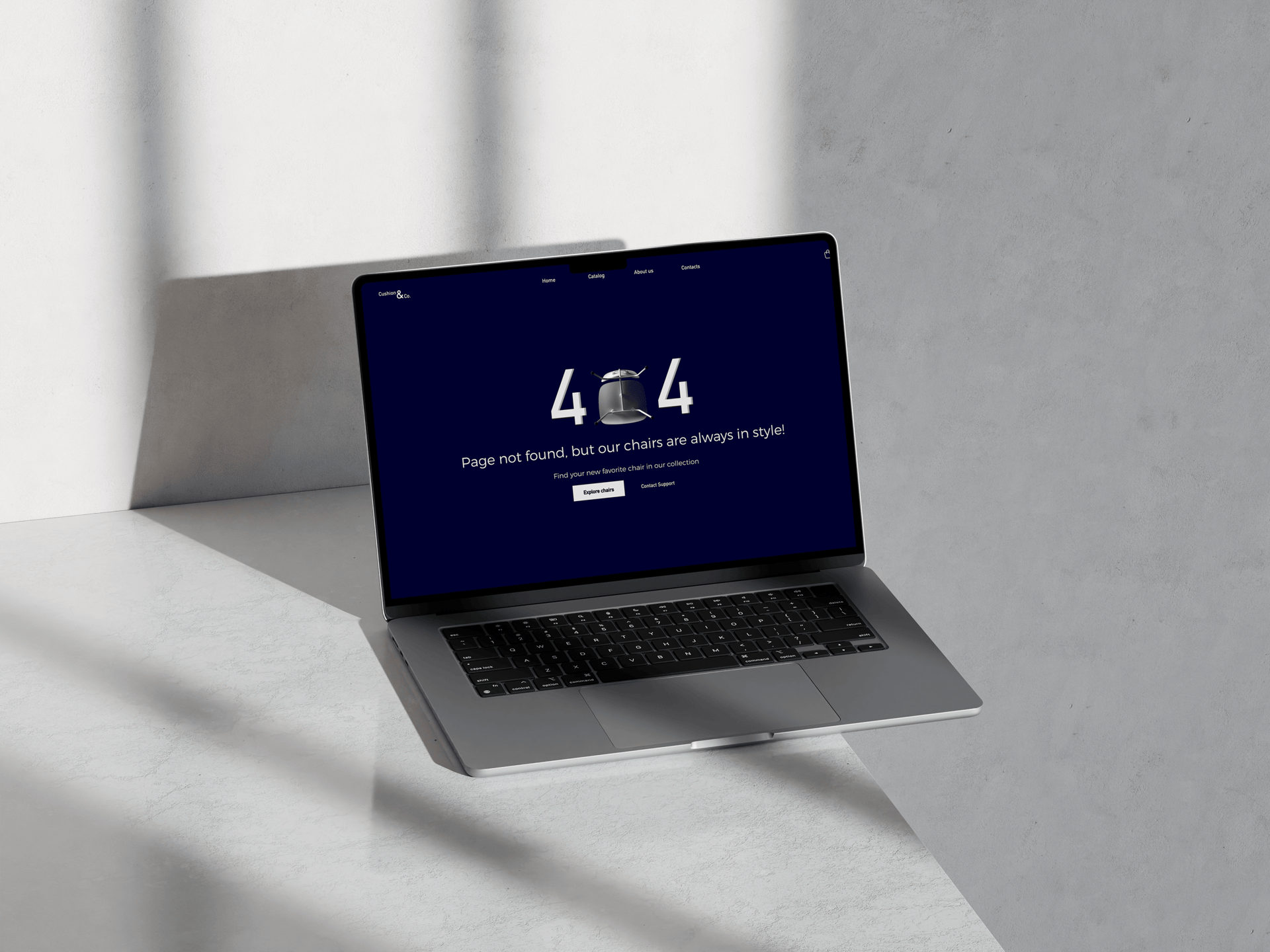
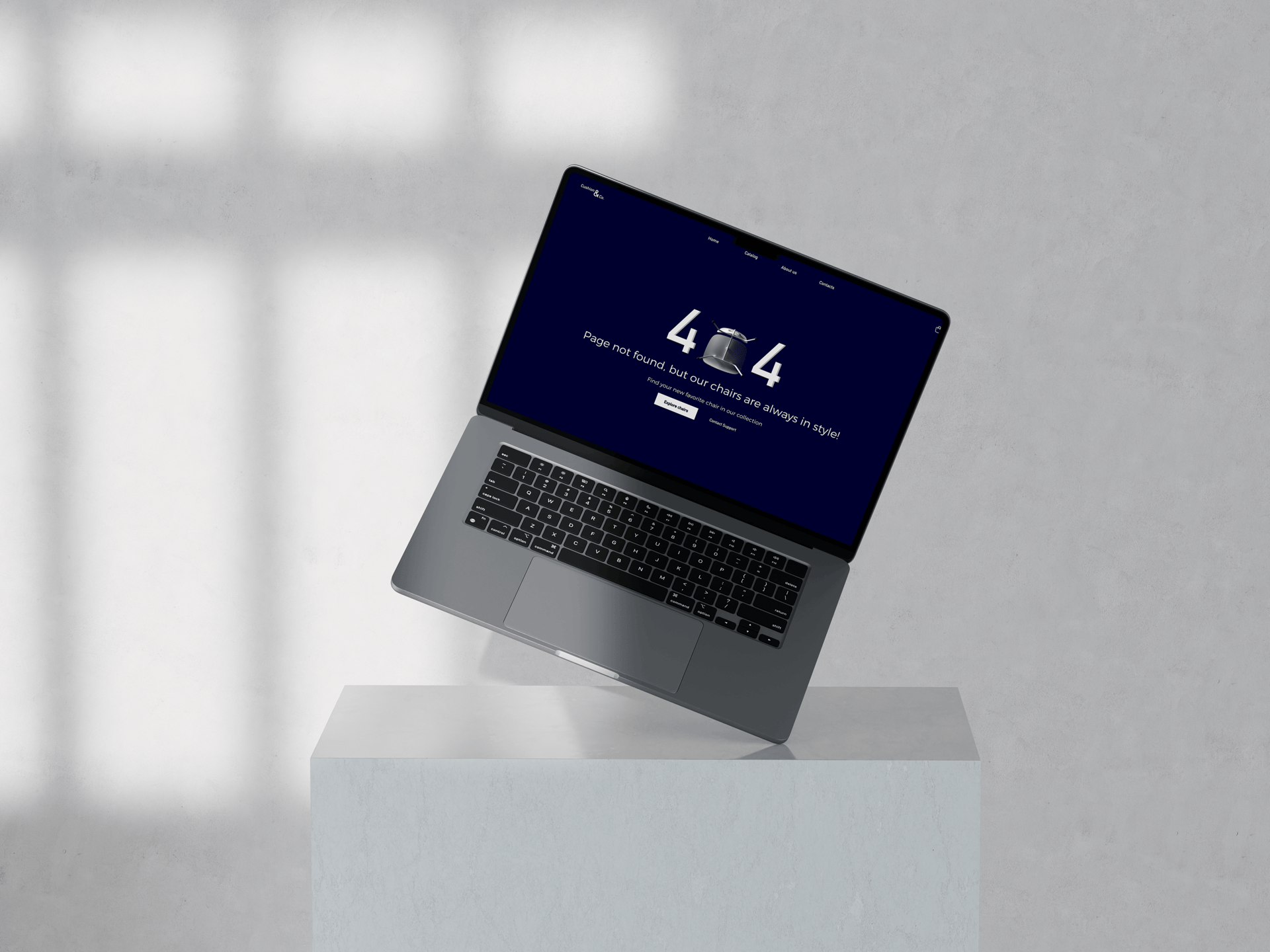
404 Error Page
Cushion & Co.
Furniture Retailer
A 404 error page is often the most neglected screen in any product. For Cushion & Co., a fictional furniture brand, I treated the error as a brand moment instead. The chair-as-zero concept in the 404 lockup ties the error directly to the brand's product category, making an otherwise frustrating dead end feel intentional and characterful. Navigation recovery options and a support CTA ensure the page is also functional, not just clever.
Reflection
What 100 days actually taught me
The most important outcomes of the DailyUI Challenge weren't visible on screen. They were habits, instincts, and a different relationship with the act of sharing work in public.
Habit beats talent
Showing up every day mattered more than any single brilliant idea. Consistency is a skill.
Constraints are a gift
One prompt, one day, one screen. The limits forced clarity and stopped overthinking.
Sharing early builds confidence
Posting work before it felt polished taught me that progress is more honest than perfection.
Range is underrated
Designing 100 different product types in 100 days built a mental library I draw from constantly.
Work with me
Need sharp UI design for your product?
From design systems to full visual overhauls, I bring craft and precision to every screen. Tell me about your project and let's see what we can build.
Next project