


Graduation Project
Workspace Booking
01Client
Wunderbar Agency
Role
Lead UX/UI Designer
Year
Sep 2025 - Feb 2026
Platform
Desktop + Mobile
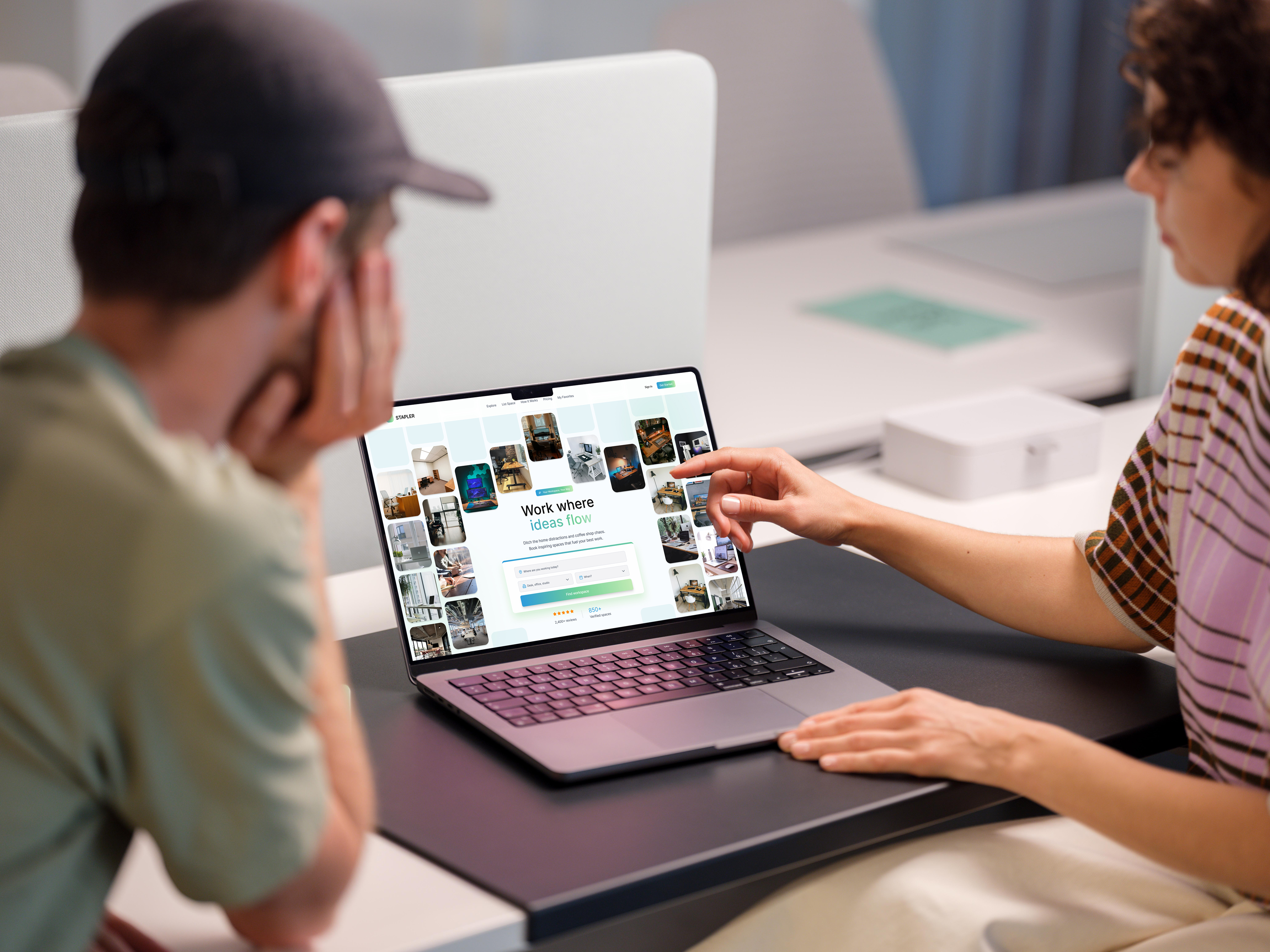
Designed during my graduation internship at Wunderbar, a digital agency in Enschede. I led the full design of a workspace booking platform from first concept to high-fidelity prototype, across desktop and mobile.
Six rounds of A/B testing, two competing concepts, and continuous iteration on real user feedback. The outcome is a complete design system ready for developer handover.
0
A/B Testing Rounds
0+
Screens Designed
0
Platforms
0
Competitors Analysed
Challenge
Workspace platforms are confusing, opaque, and slow
Most competitors (WeWork, Regus, Spaces) force users through multi-step contact forms, hidden pricing, and manual confirmations. Four out of five platforms I analysed did not allow direct booking at all. Freelancers and office managers needed something fundamentally different.
Pain Points
Lack of transparent pricing and hidden fees
Complicated booking flows, no direct confirmation
Poor mobile experience and limited filtering
No trust elements: missing reviews or host info
Inconsistent visual hierarchy across pages
Design Goals
Enable full booking in 3 clear, guided steps
Surface pricing, reviews, and location upfront
Build trust through calm, consistent visual style
Responsive design for desktop and mobile
Deliver a scalable design system for handover
Competitor Analysis

Process
Build. Test. Learn. Repeat.
Research
Competitor analysis of five platforms, user persona development, and a style board comparing five design directions from neobrutalism to glassmorphism.
Concept
Two complete high-fidelity concepts built in Figma and presented to stakeholders. The chosen direction refined across two-week sprint cycles.
Test + Refine
Six A/B testing rounds with freelancers and office workers. Every layout decision (grid, hierarchy, buttons, forms) validated before finalising.
User Research
Two personas. One platform.
The platform serves two distinct user types with very different mental models. Both needed the same core values: clarity, speed, and trust. Understanding them separately was what made the design decisions possible.
Lisa de Vries
Freelance UX Designer · 29 · Amsterdam
I just need a quiet desk for tomorrow, without filling out a 20-minute form.
Frustrations
- xCannot see total price before booking
- xNo same-day availability options
- xBooking forms are long and confusing
Needs
- ✓Affordable, quiet desk near her location
- ✓Last-minute booking with instant confirmation
- ✓Honest reviews from other freelancers
Context
Lisa books co-working desks 3-4 times a month, usually the morning of. She expects the experience to be as frictionless as Airbnb and abandons platforms immediately if pricing is unclear.
Hans Jansen
Office Manager · 52 · Enschede
I want to know who is renting my space and get paid, without chasing anyone.
Frustrations
- xCannot verify tenants before accepting bookings
- xExisting platforms charge high commissions
- xManual back-and-forth wastes too much time
Needs
- ✓Reliable tenants with transparent profiles
- ✓Clear pricing with secure payment
- ✓Quick listing process with good visibility
Context
Hans manages a 200-person office with underused meeting rooms. He wants to list spaces without contracts or account managers, and needs the platform to handle payments and scheduling automatically.
Concepts
Two directions explored
After researching five competitors and building a style board, two complete concepts were designed in Figma and presented to stakeholders. Both were evaluated against usability, readability, and ability to build trust.
Neobrutalism
Not chosen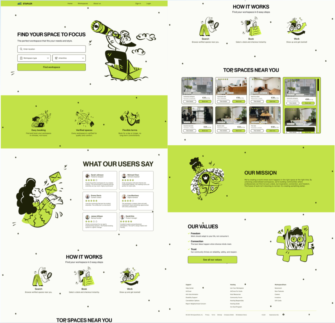
Visually distinct and energetic, but users found the aesthetic too unfamiliar for a booking platform, generating hesitation rather than confidence.
Glassmorphism
Chosen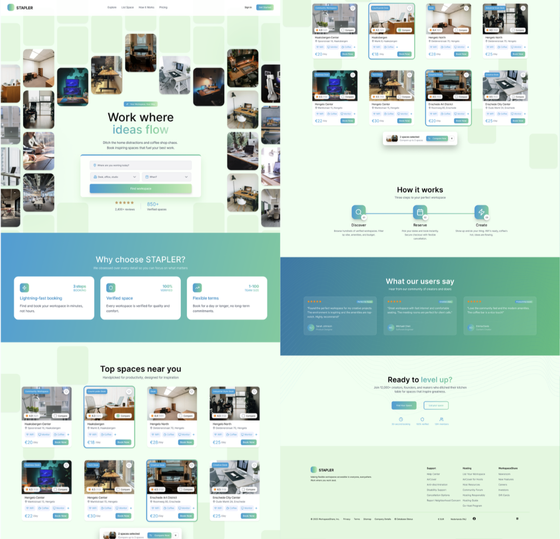
Users consistently described this as clearer, faster to navigate, and more trustworthy, matching the conventions they expect from booking platforms.
"For me it seems clearer and easier to use - it feels faster and easier to navigate."User feedback, A/B Test Round 1
A/B Testing
Six rounds of structured testing
Every layout decision was validated through direct comparison testing with freelancers and office workers. Users consistently favoured fast scanning, visible controls, and calm visual hierarchy over style alone.
| Round | Focus Area | Key Insight | Outcome |
|---|---|---|---|
| 1 | Landing page: layout, colour palette, hero | Left-aligned text matched reading order. Light backgrounds preferred. Blue palette chosen over neon green. | Concept 1 refined |
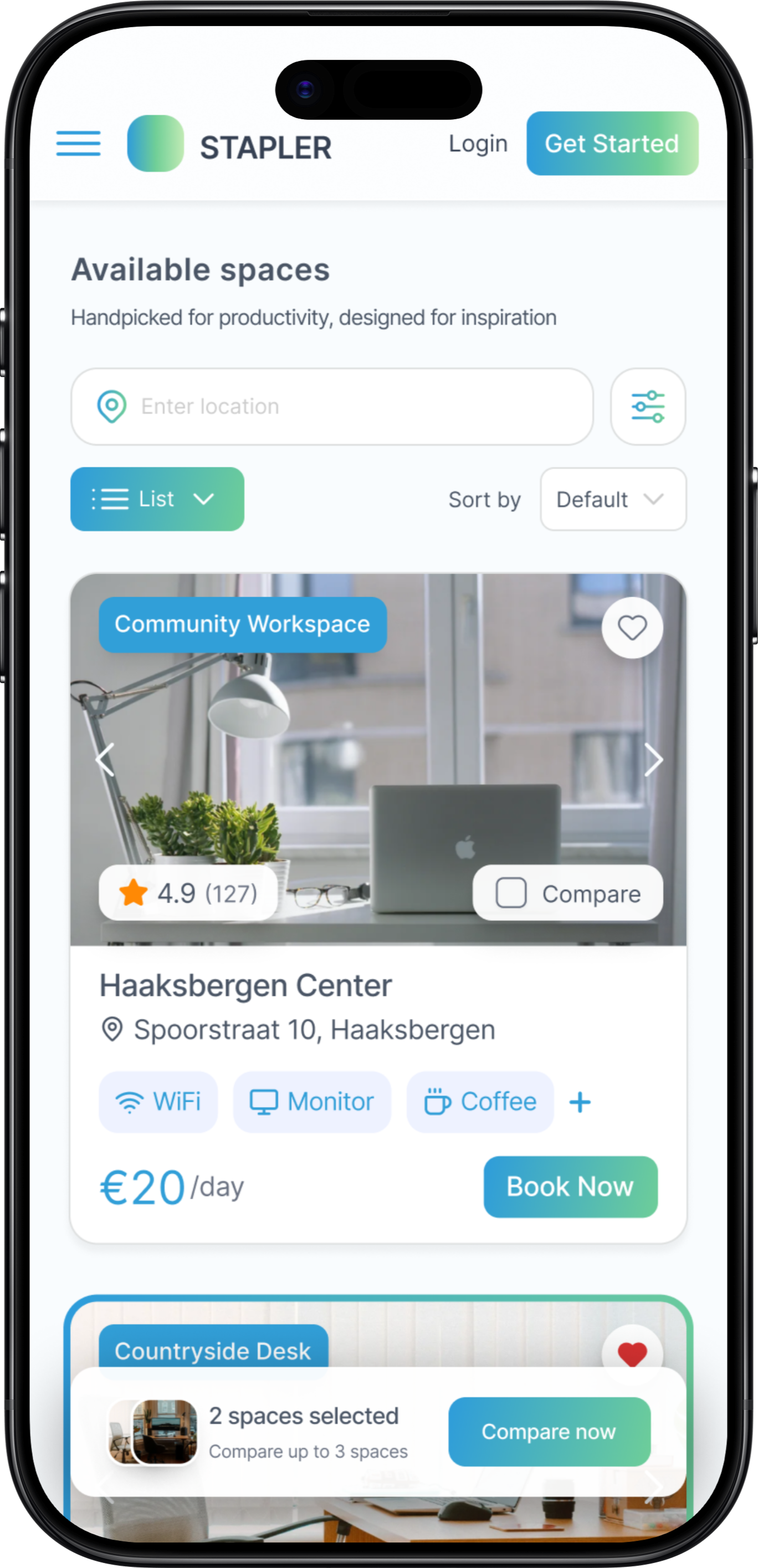
| 2 | Search page: nav, results layout, grid | Compact grid views beat large cards. Visible "Book now" CTA reduced hesitation at first interaction. | Grid layout adopted |
| 3 | Concept 2 search: sorting, filters, cards | Sorting controls above results reduced confusion. Outlined "View Details" button outperformed text-only version. | Controls surfaced |
| 4 | Mobile search + workspace overview | Two-column mobile grid consistently preferred. Map-first location layout matched user expectations. | Mobile grid confirmed |
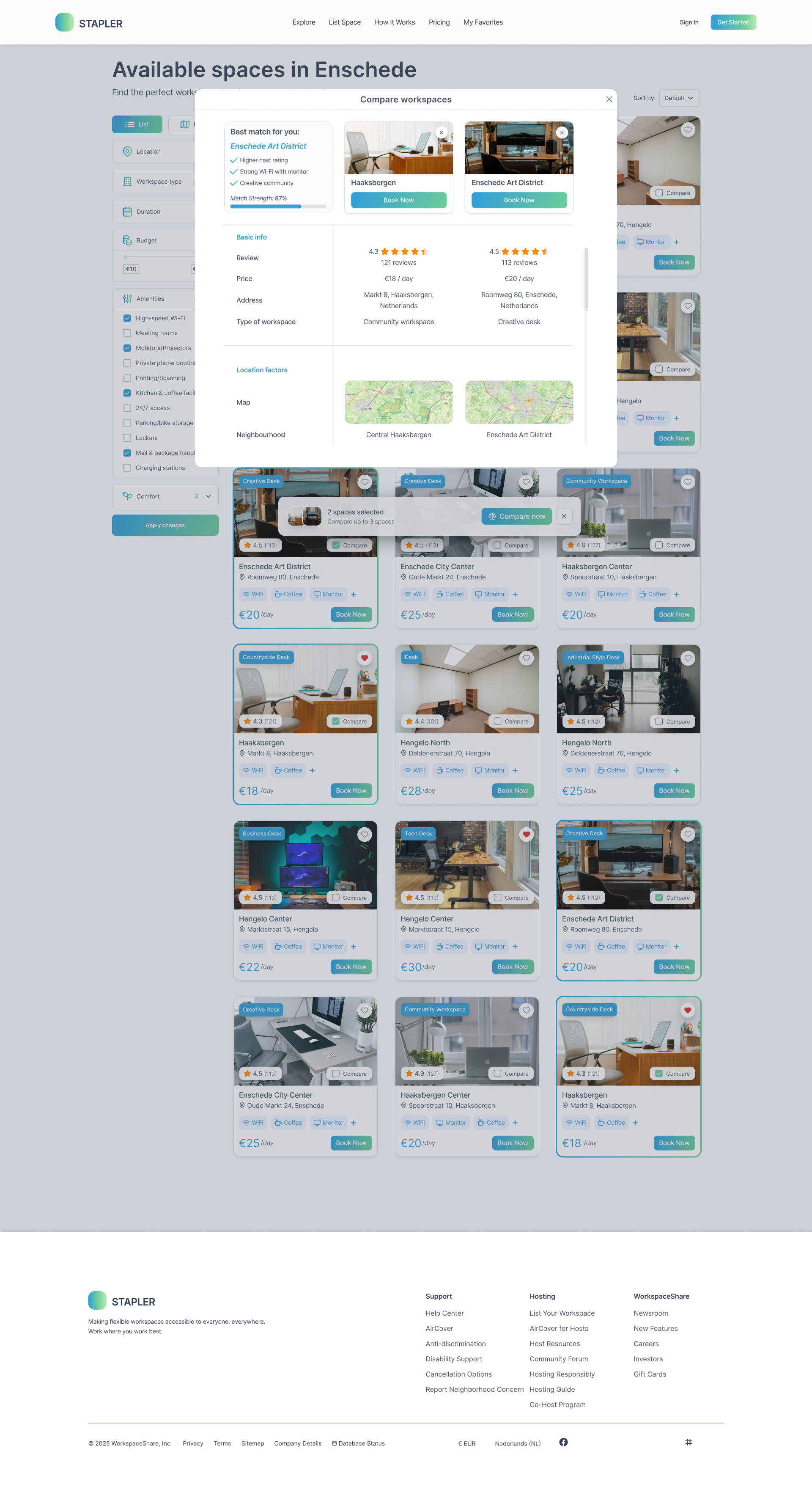
| 5 | Comparison feature: cards, table, scroll | Checkmarks with crossed labels made differences scannable. Recommendation box increased decision confidence. | Compare finalised |
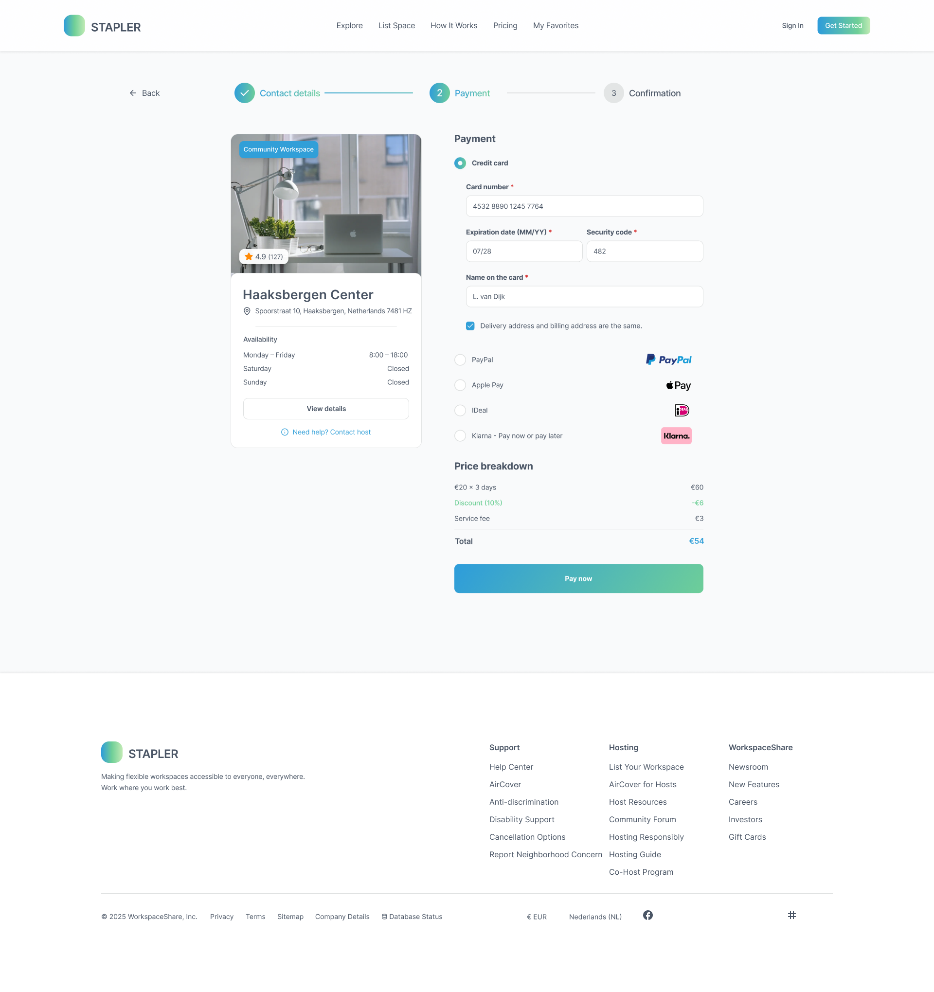
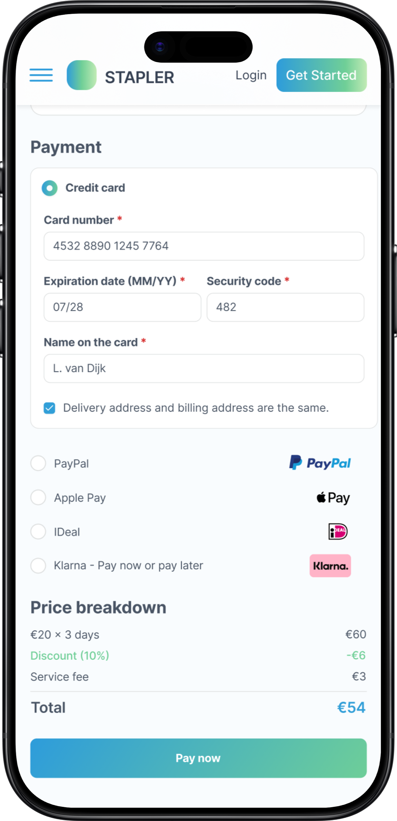
| 6 | Booking flow: forms, payment, confirmation | Input icons reduced errors. Grouped credit card form increased perceived security. Summary page gave reassurance. | Booking flow complete |
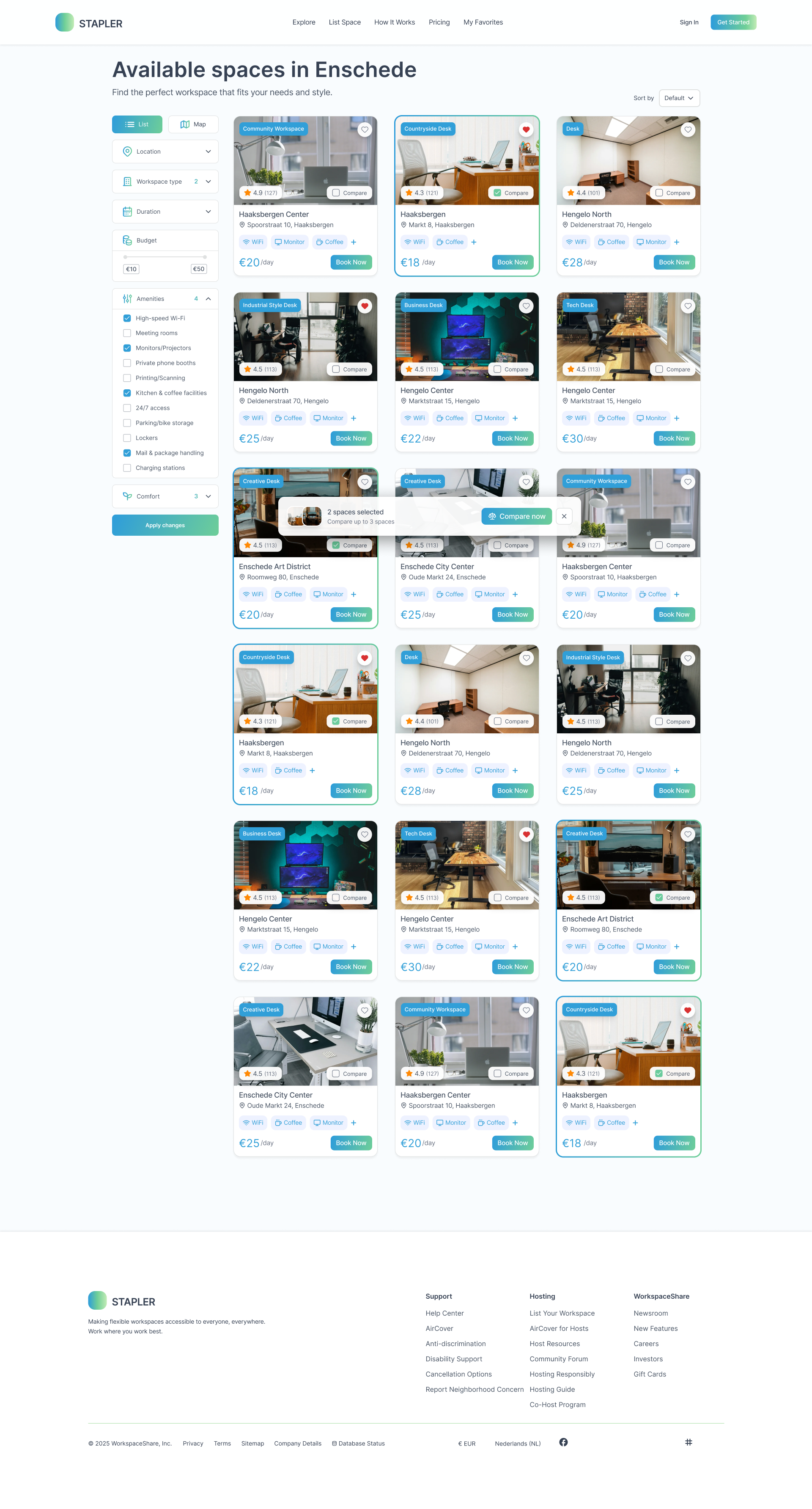
Final Design
End-to-end design across all screens
After six testing rounds and continuous refinement, the final design covers every key user flow across desktop and mobile: from discovery and comparison to booking and confirmation.
Desktop
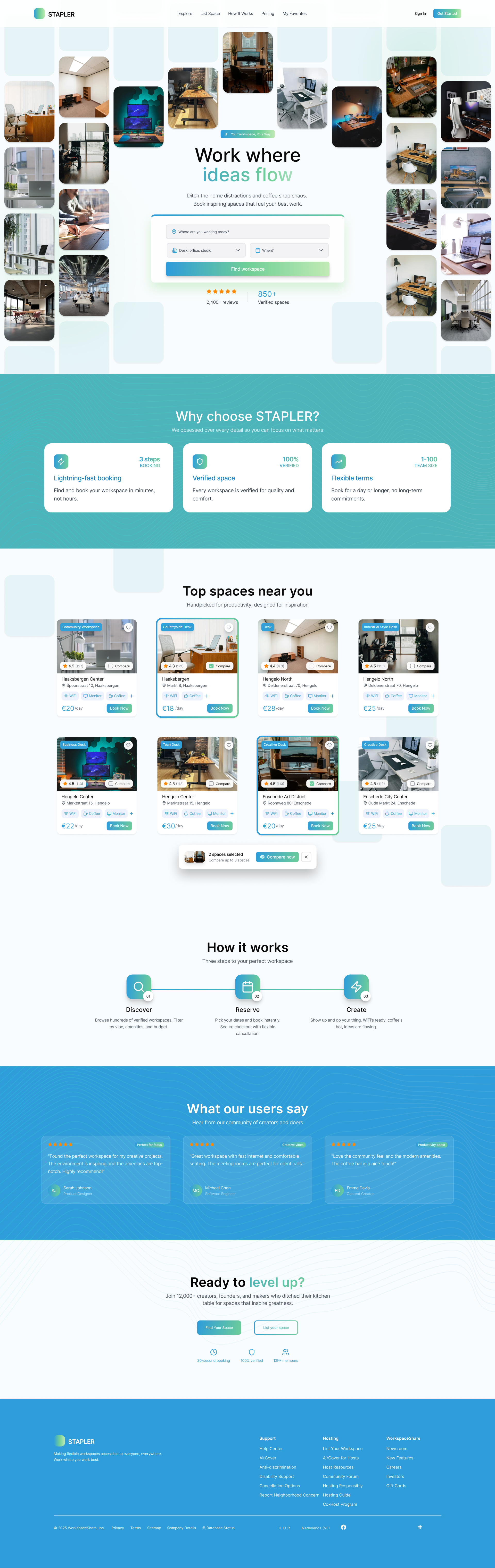
Booking Flow
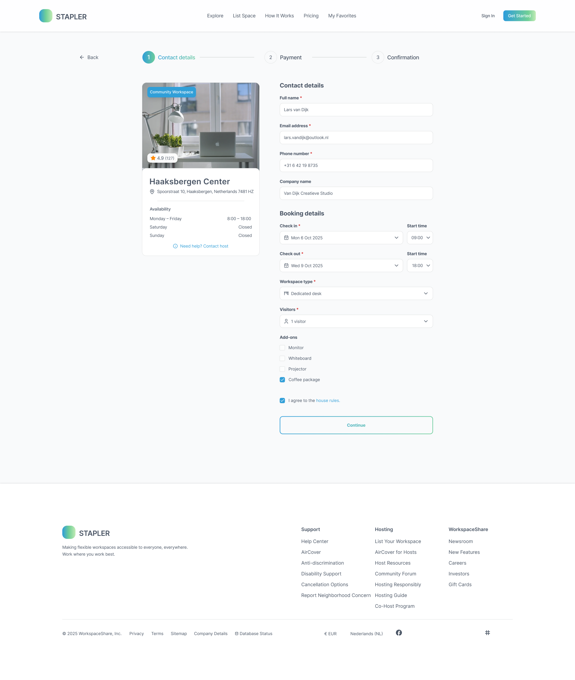
Step 1 - Date and Time
Step 2 - Review
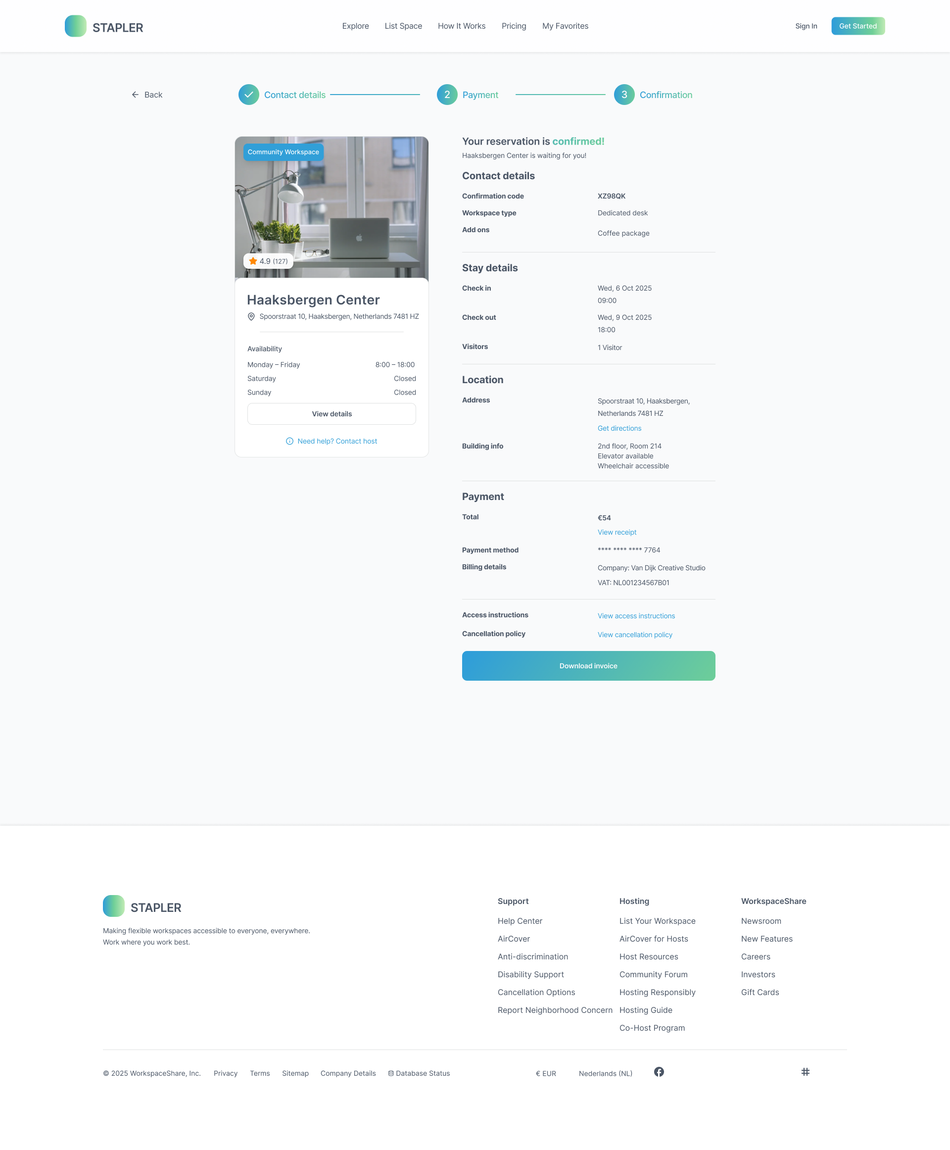
Step 3 - Payment
Mobile
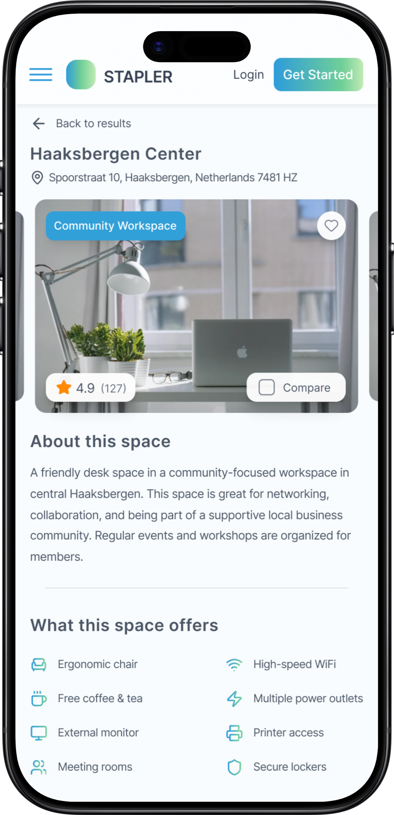
Home
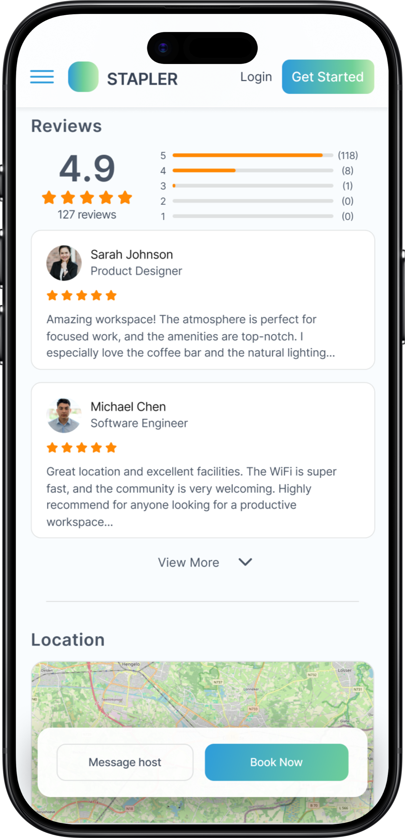
Search
Overview
Booking
Design System
Built for consistency and handover
The STAPLER design system was delivered to Wunderbar as a complete Figma package. It includes a 5-token colour palette built around a sky blue primary and mint green accent, Inter as the single typeface across all weights, reusable UI components, workspace photography guidelines, and a spacing and radius scale ready for developer handover.
Colour Palette
Primary
#3BB6E8
Industry
#6CCF82
Darkened
#374F63
Muted
#9AAAB8
Surface
#F0F4F8
Typography
Components
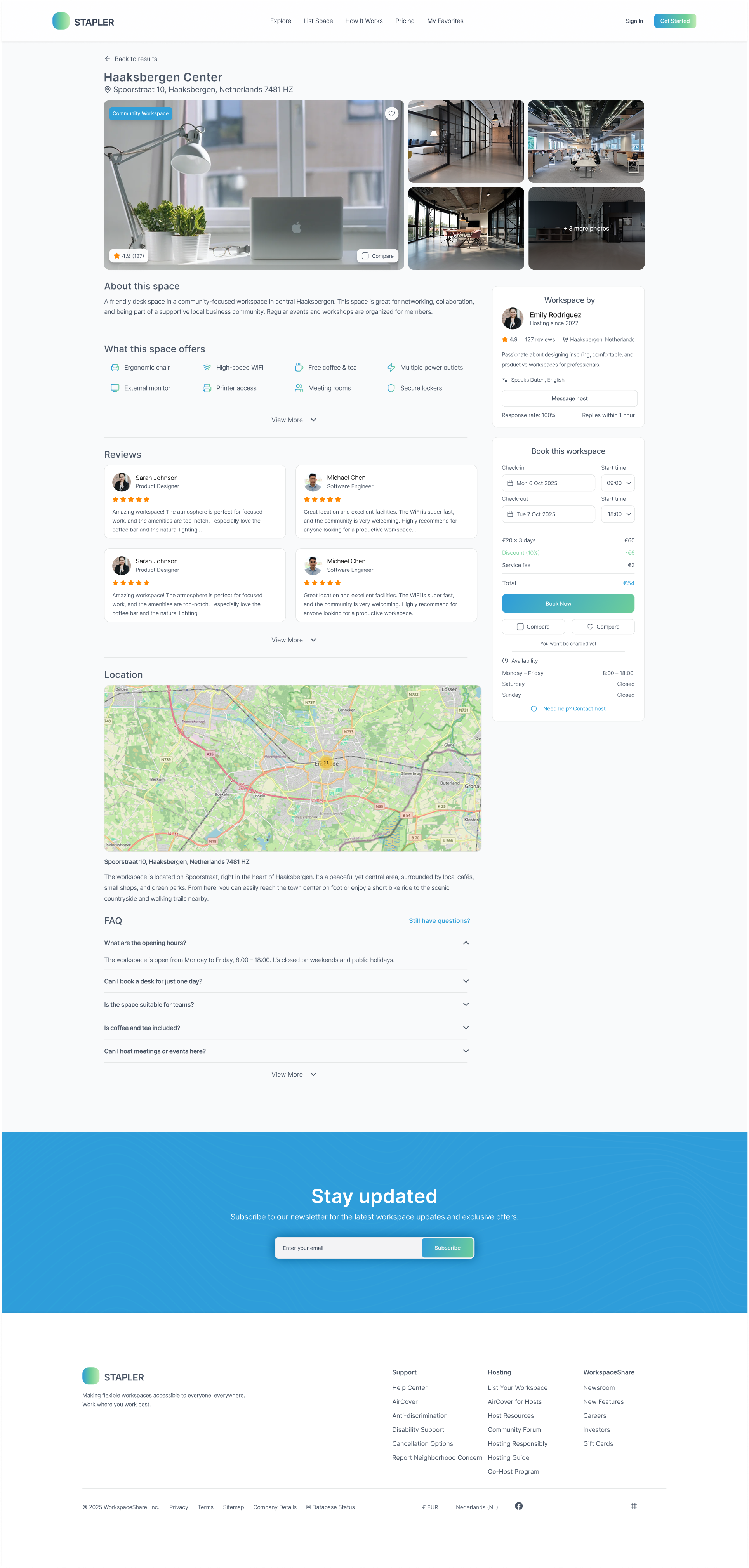
Haaksbergen Center
AvailableEnschede · ★ 4.9 (127)
Typeface
Inter (Heading + Body)
Border Radius
8 / 10 / 12 / 16px
Spacing
4 · 8 · 12 · 16 · 24 · 32px
Style Layer
Glassmorphism + backdrop blur
Results
A validated, developer-ready foundation
After six testing rounds and continuous iteration, the final design met all success criteria and was handed over to Wunderbar as a complete Figma package.
Task Success
Users completed the full booking flow in three steps with fewer errors and less hesitation than earlier iterations.
Trust Established
Transparent pricing, visible reviews, and a grouped payment form built confidence at every stage of the journey.
Scalable System
A component library and design tokens give Wunderbar a solid foundation to build an MVP and expand iteratively.
Desktop Designs
5 key pages, high fidelity
Mobile Designs
Fully responsive
Design System
Components and tokens
Research Report
Insights and recommendations
Problems I Faced
What made this project hard
Every project produces friction that doesn't show up in the final screens. These were the four problems that genuinely slowed me down and changed how I approach design work.
Designing without a brief
Wunderbar didn't hand me a fixed specification. I was expected to define the problem scope myself, run competitive research, and propose a direction before any design work started. Starting from a blank canvas during an internship was disorienting at first - I had to learn how to create structure where none existed, and to justify every decision to a real client rather than a tutor.
Glassmorphism that actually works
The layered transparency aesthetic looked clean in isolation but broke constantly in practice. On light backgrounds the depth disappeared. On dark content the contrast dropped below accessible thresholds. I rebuilt the depth system three times before landing on a combination of backdrop blur, border opacity, and a consistent surface-to-background ratio that held up across both light and dark mode.
Users wanted more information than I gave them
My initial designs prioritised visual calm over information density. Every usability round told the same story: people stalled at the booking step because they didn't trust they had enough detail. I had to unlearn my instinct to simplify and instead learn where users need reassurance, surfacing pricing, workspace photos, host details, and reviews much earlier in the flow than I originally thought was necessary.
Designing a full system, not just screens
Wunderbar needed a handover package a developer team could actually build from. That meant every component had to be documented, spacing and radius had to be tokenised, and nothing could rely on Figma-only tricks like auto-layout hacks. Bridging the gap between a design that looks right and a design that can be built correctly was a new responsibility - and it slowed down the final design phase significantly.
Reflection
What this project taught me
Process
Running A/B tests in parallel with design sprints kept feedback cycles short and prevented assumptions from hardening. Users consistently preferred more information upfront than I initially expected, a lesson that changed how I approach hierarchy.
Design
Glassmorphism is more demanding than it looks. Making layered transparency feel calm rather than cluttered requires careful control of depth, contrast, and whitespace. The biggest lesson: design for scanning, not reading. Clarity beats cleverness.
Work with me
Building a tool your team will actually use?
Booking systems, internal platforms, workplace tools. I design digital products that balance usability with scale - so adoption is a given, not a hope.
Next project