DailyUI Challenge
Flyhire
02Project Type
DailyUI Challenge
Role
UI/UX Designer
Year
2025
Platform
Mobile + Web
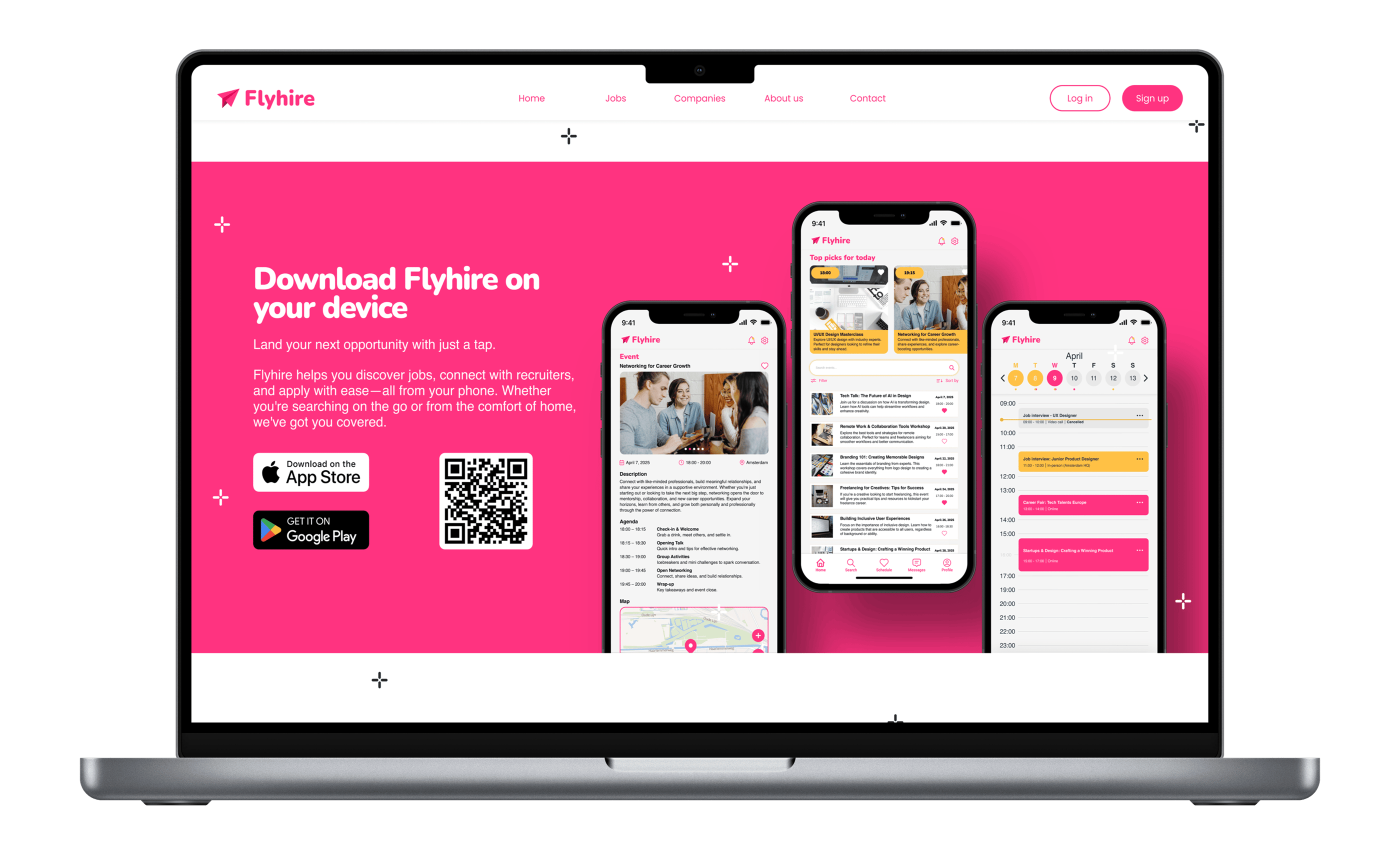
Flyhire reimagines the job search as something to look forward to rather than dread. Designed as part of the DailyUI Challenge, this project challenged me to create a career platform with real emotional personality, breaking away from the cold, corporate interfaces that define the industry.
A vibrant pink and yellow palette, custom illustration spaces, and a mobile-first approach deliver an experience that feels warm, approachable, and genuinely human across both mobile and web.
0+
Screens Designed
0
Platforms
0
Process Stages
0
Design Challenge
Challenge
Job hunting is stressful. The design doesn't have to be.
Traditional job platforms prioritize information density over human experience. The typography is dense, the layouts are rigid, and the color palettes signal authority rather than approachability. Flyhire was designed from the ground up to challenge every one of those conventions.
Pain Points
Cold, corporate interfaces create job-search anxiety
Overwhelming listings with no emotional hierarchy
Onboarding feels like filling out government forms
Mobile experience is an afterthought on most platforms
Zero brand personality or visual delight
Design Goals
Build an identity that feels warm and encouraging
Reduce cognitive overload through clear visual hierarchy
Design mobile-first with a seamless web counterpart
Create emotional resonance through color and illustration
Make every screen feel intentional and brand-consistent
If we design with empathy first, the job search becomes less about rejection and more about discovery. The interface should feel like a friend who believes in you.
Design Philosophy / Flyhire
Process
Five stages. One unified vision.
Define the Vision
Problem framing, competitive audit of five job platforms, and a clear creative brief: make the job search feel human, energetic, and encouraging.
Sketch + Wireframe
Mapped core user flows in Figma: sign up, browse jobs, attend events, schedule interviews. Low-fidelity wireframes established the information architecture.
Visual Design
Developed a bold, playful brand identity. Pink and yellow chosen deliberately to break category conventions. Consistent UI patterns applied across all screens.
Prototype
Built fully clickable prototypes with smooth transitions and micro-interactions to validate the experience flow end-to-end across mobile and web.
Iterate
Each DailyUI prompt added a new screen. With every addition, I refined consistency, tightened the design system, and pushed the brand further.
User Research
Two sides of the same conversation.
Flyhire serves two distinct audiences: job seekers who feel overwhelmed, and recruiters who feel ignored. The design had to speak to both without compromising for either. Understanding their emotional state, not just their tasks, was what shaped every decision.
Maya van den Berg
Recent Graduate · 23 · Amsterdam
I need to find my first real job without feeling judged by a stiff, corporate interface.
Frustrations
- xJob listings feel identical and uninspiring
- xConfusing multi-step application flows
- xPlatforms feel like they were built for HR, not candidates
Needs
- ✓Visual clarity and an encouraging tone of voice
- ✓Event and networking features beyond job boards
- ✓Mobile-first experience she can use on the go
Context
Maya is applying for her first design role after graduating. She checks job boards daily from her phone. She abandoned Glassdoor after 3 minutes because the interface felt overwhelming and cold.
Jasper de Wit
Talent Recruiter · 36 · Rotterdam
I want to find candidates who are excited about culture, not just salary numbers.
Frustrations
- xLow engagement from passive, disengaged applicants
- xExisting platforms feel transactional, not relationship-driven
- xHard to communicate brand personality through job listings
Needs
- ✓Rich company profiles to showcase culture and events
- ✓Candidate matching beyond keyword filters
- ✓A platform that attracts motivated, brand-aware talent
Context
Jasper recruits for fast-growing tech startups. He wants candidates who care about culture fit, not just compensation. He believes the right platform should do half the storytelling for him.
Concepts
Two directions explored
Every strong design decision starts with a comparison. Before committing to the vibrant direction, I built out the alternative fully enough to be honest about its strengths. The data made the choice clear.
Corporate Minimal
Not chosenSafe and readable, but entirely forgettable. Testing revealed it triggered the same emotional response as existing platforms, defeating the purpose of the project entirely.
Bold + Human
ChosenThe vibrant palette felt risky but landed exactly right. Users described it as energetic, memorable, and refreshing - the first platform that felt like it was rooting for them.
"It actually made me feel excited. I've never said that about a job board before."Feedback / Concept Review
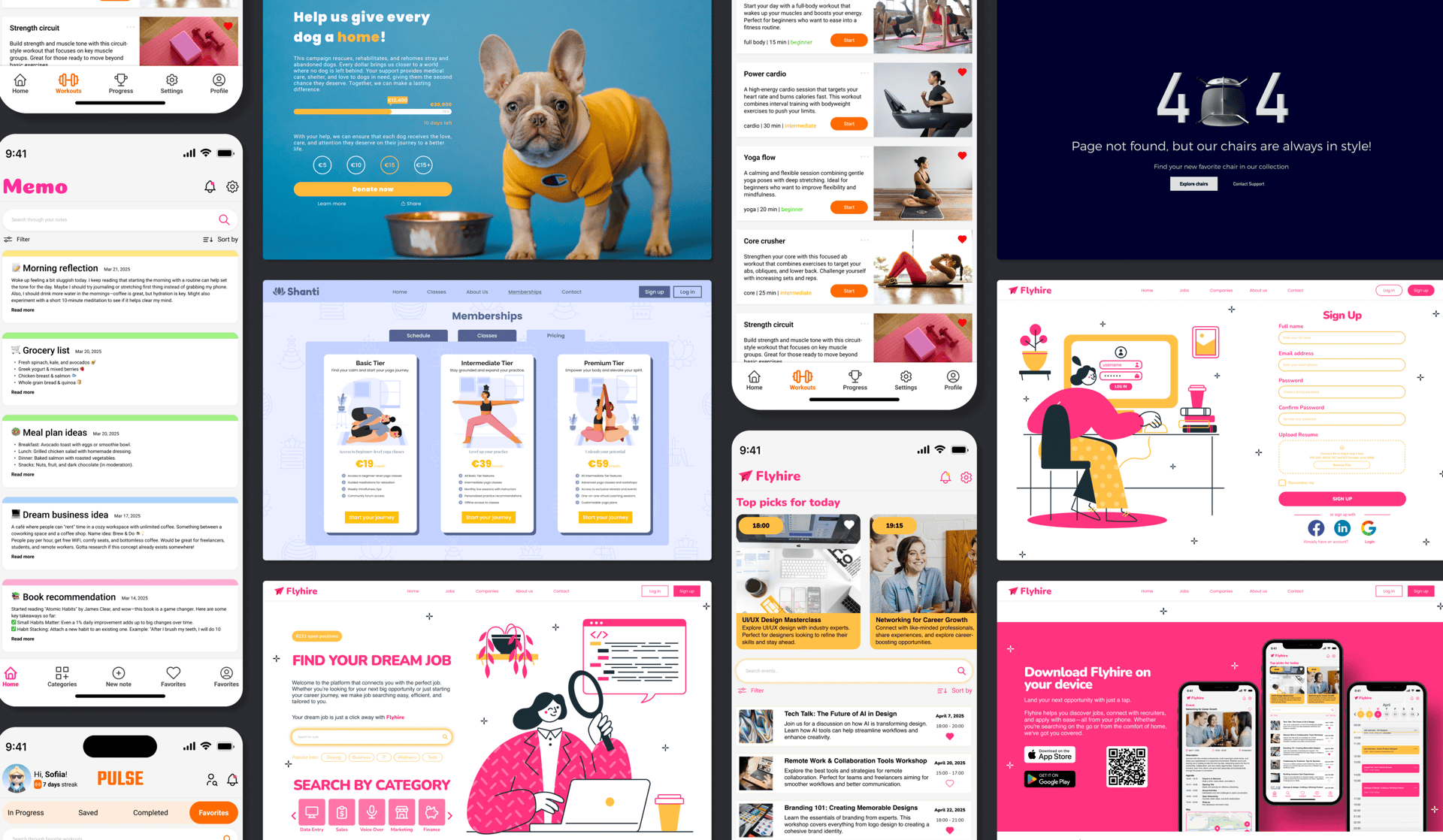
Final Design
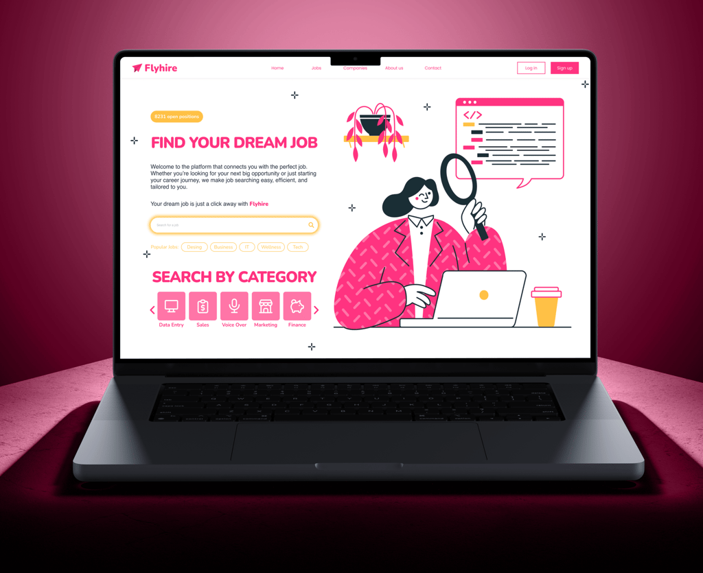
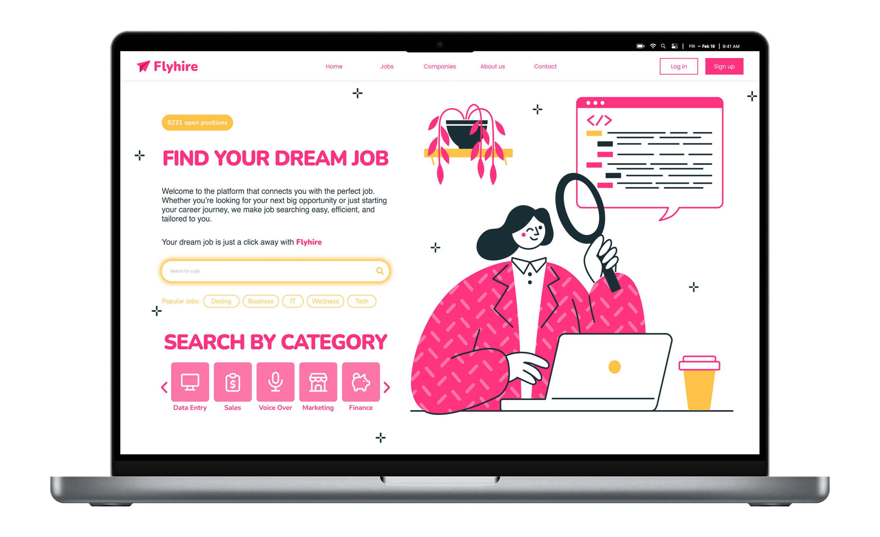
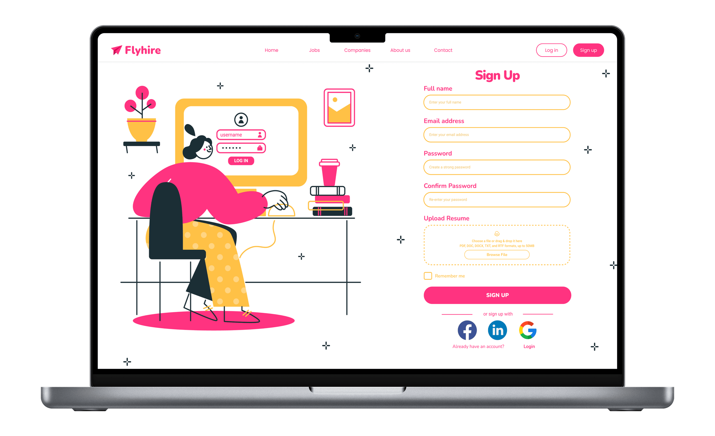
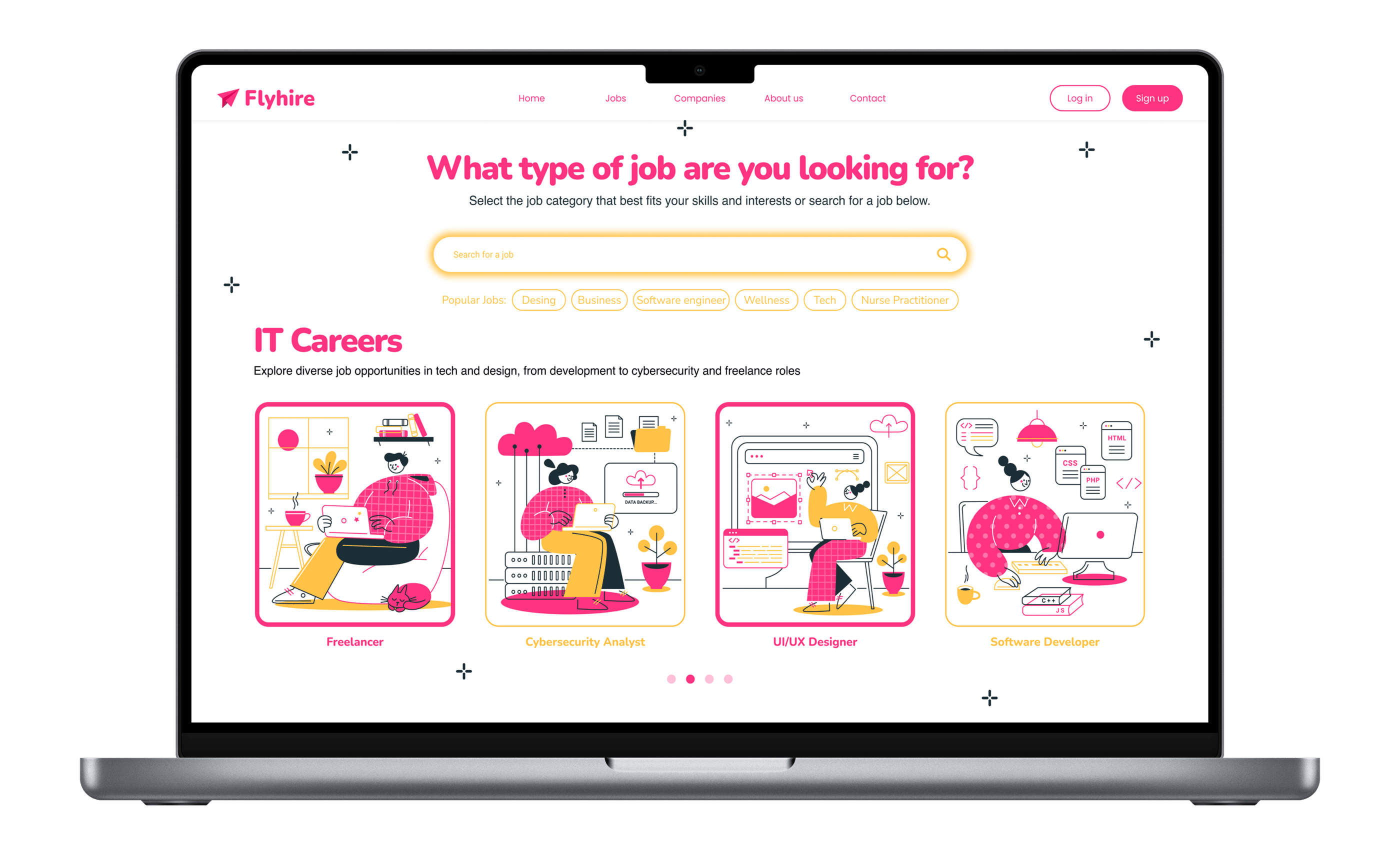
Every screen tells the same story
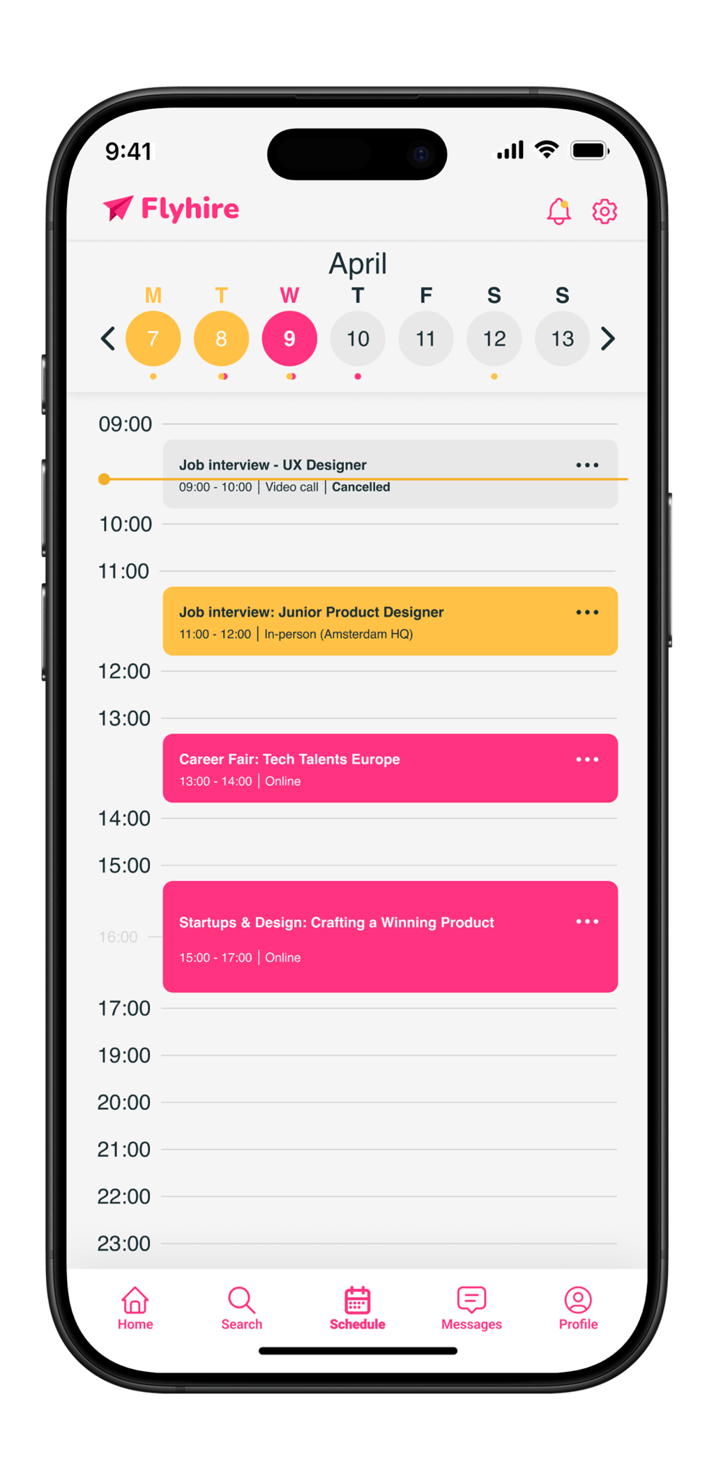
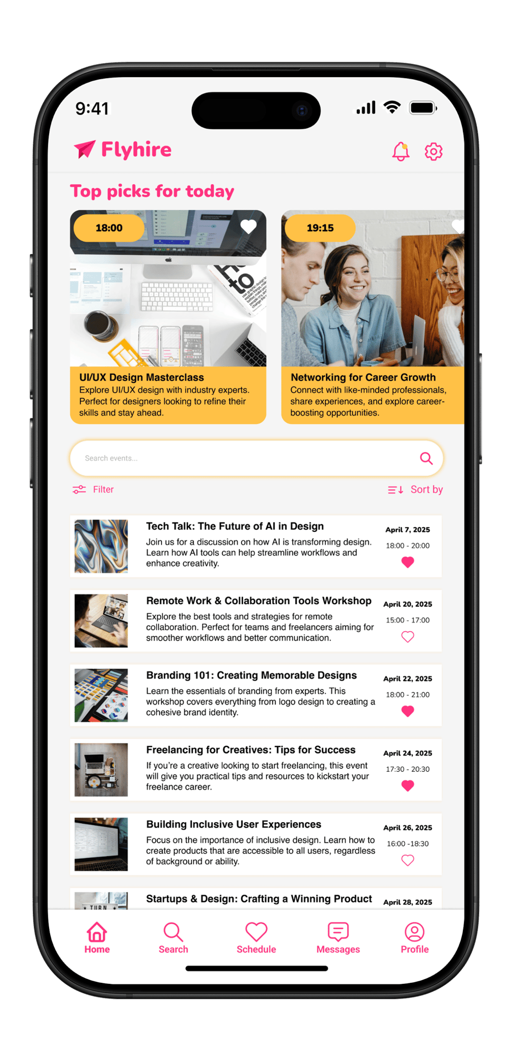
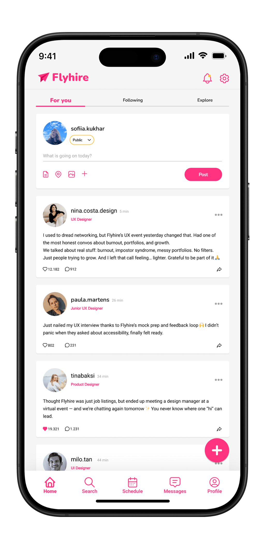
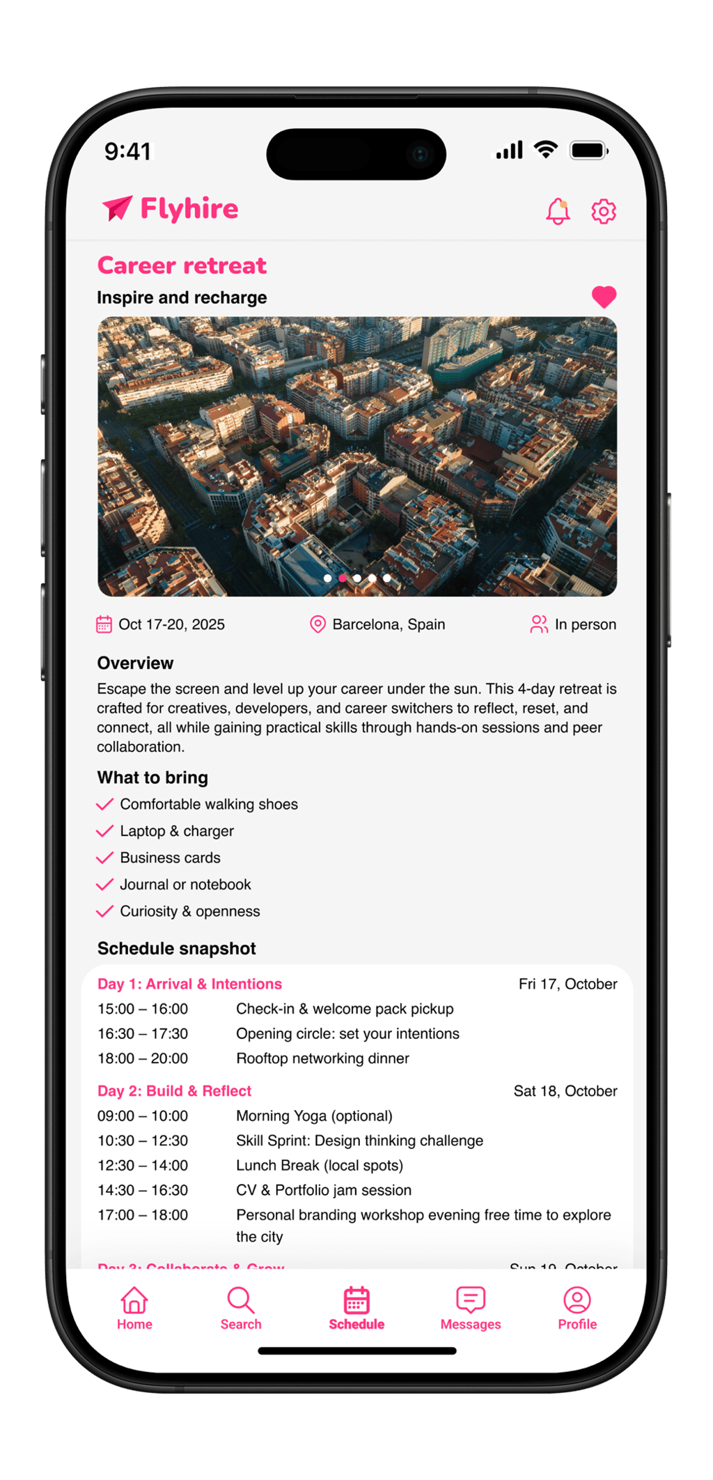
From onboarding to job listings, event scheduling to interview confirmation, every screen maintains a consistent visual language. Pink drives action. Yellow signals opportunity. The dark navy grounds the energy without losing it.
Web
Mobile
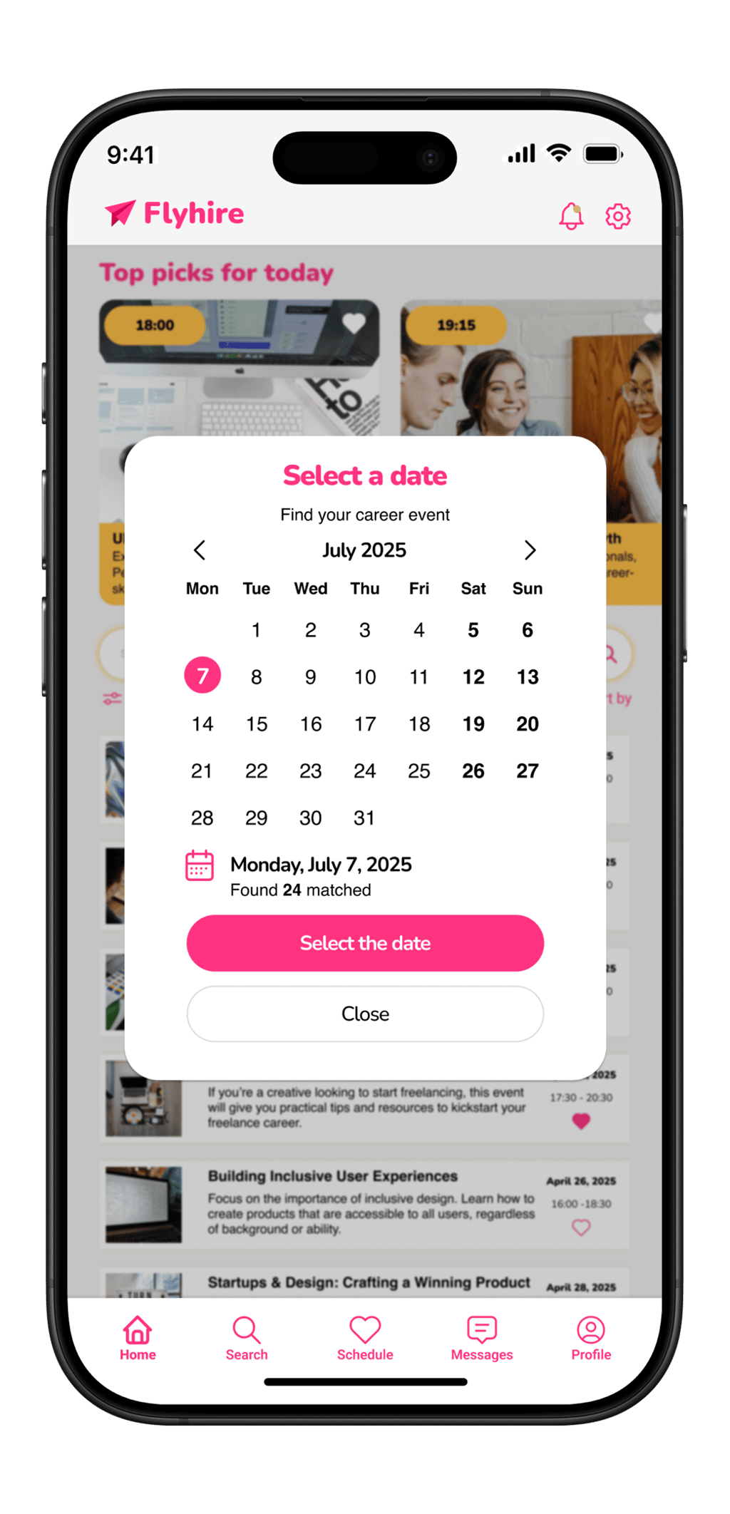
Home
Event Listing
Scheduling
Date Picker
Status Update
Invitation
Design System
A brand built on emotional logic
Every color in Flyhire's palette carries a deliberate emotional weight. The vivid pink signals action, warmth, and confidence. The yellow radiates optimism and momentum. The navy anchors without intimidating. Together they form a brand language that feels wholly different from every competitor in the space.
Colour Palette
Primary
#E8437A
Energy
#F5C842
Ground
#1A1A2E
Muted
#B0B4C8
Surface
#FFF0F5
Typography
Components
Product Designer
NewStripe Inc. Amsterdam Remote
Typeface
Plus Jakarta Sans / Inter
Border Radius
8 / 12 / 16 / 24px
Spacing
4 8 16 24 32 48px
Style Layer
Vibrant flat + soft gradients
Results
A product that earns emotional trust
The DailyUI framework pushed Flyhire from a single screen into a fully cohesive product. Each new prompt added depth to the system and forced sharper thinking about how a brand holds together across contexts.
Brand Differentiation
Flyhire established a visual identity with no direct comparables in the job platform space. The pink/yellow palette is immediately recognizable and memorable.
Design Consistency
A unified component library and token system ensures every screen from onboarding to confirmation feels like part of a single, considered product.
Emotional Resonance
The core design goal - making job searching feel encouraging rather than anxiety-inducing - was validated consistently across feedback from target users.
Mobile Screens
6 unique screens, hi-fi
Web Screens
6 unique screens, hi-fi
Design System
Colors, type, components
Tool
Figma, full prototype
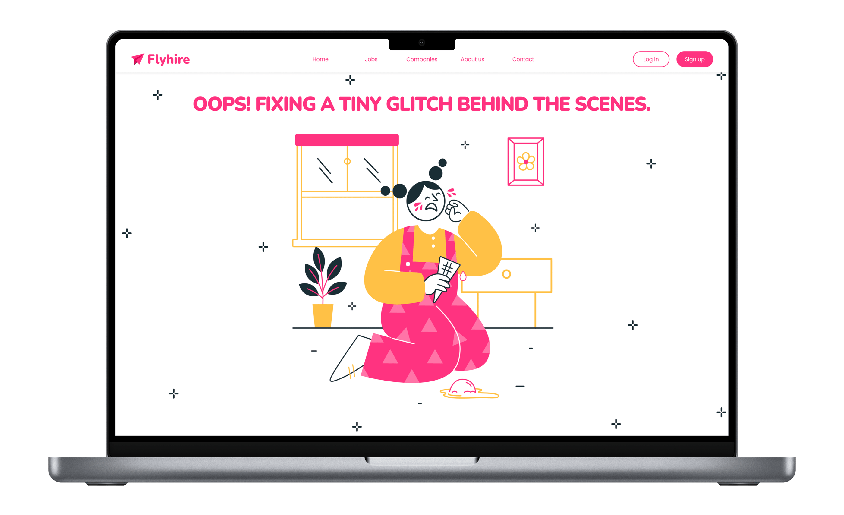
Problems I Faced
What made this project hard
Every project produces friction that does not show up in the final screens. These were the four problems that genuinely slowed me down and changed how I approach design work.
Breaking category conventions without losing credibility
Every instinct built from studying professional interfaces says career products should be neutral, conservative, and safe. Going pink and yellow meant fighting that instinct on every screen. The challenge was not picking the colors - it was making them hold at every scale: button states, form fields, error messages, and empty states all had to carry the palette without tipping into garish. Each new screen was a fresh test of whether the concept could sustain itself.
Designing without real users to test on
The DailyUI format is a solo exercise. There was no client, no test group, and no usability rounds to catch mistakes before they hardened into the design system. Every hierarchy call, every interaction pattern, every piece of copy had to be justified through reasoning alone. I had to learn to argue both sides of each decision before committing, because there was no external voice to push back when something was not working.
Keeping a growing system consistent
The DailyUI structure adds screens incrementally, one prompt at a time. By screen six, decisions made at screen one were constraining what was possible. Spacing tokens defined for a simple card layout did not stretch cleanly to a full scheduling interface. I rebuilt parts of the design system twice mid-project as the scope grew, which meant retroactively updating earlier screens to stay consistent - not a cost I had anticipated at the start.
Making mobile and web feel like the same product
Designing both platforms in parallel meant every UI decision had to work at two completely different interaction scales. Touch targets that felt right on mobile looked oversized on web. Information hierarchies that scanned well on a small screen became sparse and unfinished at 1440px. I kept returning to web screens after solving mobile problems, and vice versa, which doubled the iteration time on components I thought were finished.
Reflection
What this project taught me
On Color
Choosing pink and yellow for a professional platform was the highest-risk decision in this project. Every design convention says career products should be neutral and trustworthy. Breaking that rule deliberately taught me that emotional resonance is itself a form of trust - when people feel seen by a design, they believe in it.
On Constraint
The DailyUI structure, one screen per prompt, forced a kind of design discipline I hadn't practiced before. Without the luxury of iterating infinitely, each screen had to earn its place immediately. That taught me to decide faster and commit more fully to the directions I chose.
Work with me
Have a complex product that needs UX?
Whether it's a hiring tool, a workflow app, or a multi-step platform, I design flows that cut friction and make sense for real users. Let's talk about your project.
Next project