


Game UI Design
Sudoku Tetris
03Type
Concept Game Design
Role
UI/UX Designer
Year
2024
Platform
Mobile
Sudoku Tetris is a concept mobile puzzle game that fuses two of the most beloved game formats ever created. Designed entirely in Figma as a personal design exploration, this project pushed me to solve a genuinely hard design problem: how do you merge two games without losing what makes either one satisfying?
The answer was a deep blue grid that breathes calm under pressure, vibrant green pieces that reward correct placement, and an interface stripped down to just what the player needs in the moment. Nothing more.
0+
Screens Designed
0
Process Stages
0
Game Modes
0
Design System
Challenge
Two classic games. One coherent experience.
Sudoku is about deliberate, logical placement with no time pressure. Tetris is about rapid spatial reasoning under constant falling speed. Merging them means holding both truths at once: a game that rewards calm thinking and fast reflexes in the same move. The design challenge was to make that feel natural rather than contradictory.
Design Tensions
Sudoku demands patience; Tetris demands speed
Existing puzzle games overwhelm with visual noise
Hybrid mechanics risk feeling incoherent to both audiences
Mobile grids get crowded - numbers become unreadable under pressure
No reference point: no one had designed this exact game
Design Goals
One unified game loop that feels natural, not forced
Grid that stays readable at every game speed
Visual feedback that communicates rules without text
Mobile-first ergonomics: thumb reach, tap targets, tilt-safe layout
A brand identity strong enough to stand alone
"I focused on clarity, balance, and responsiveness throughout the interface - every pixel had to earn its place."Design philosophy, Sudoku Tetris
Process
From mechanics to motion.
Concept & Mechanics
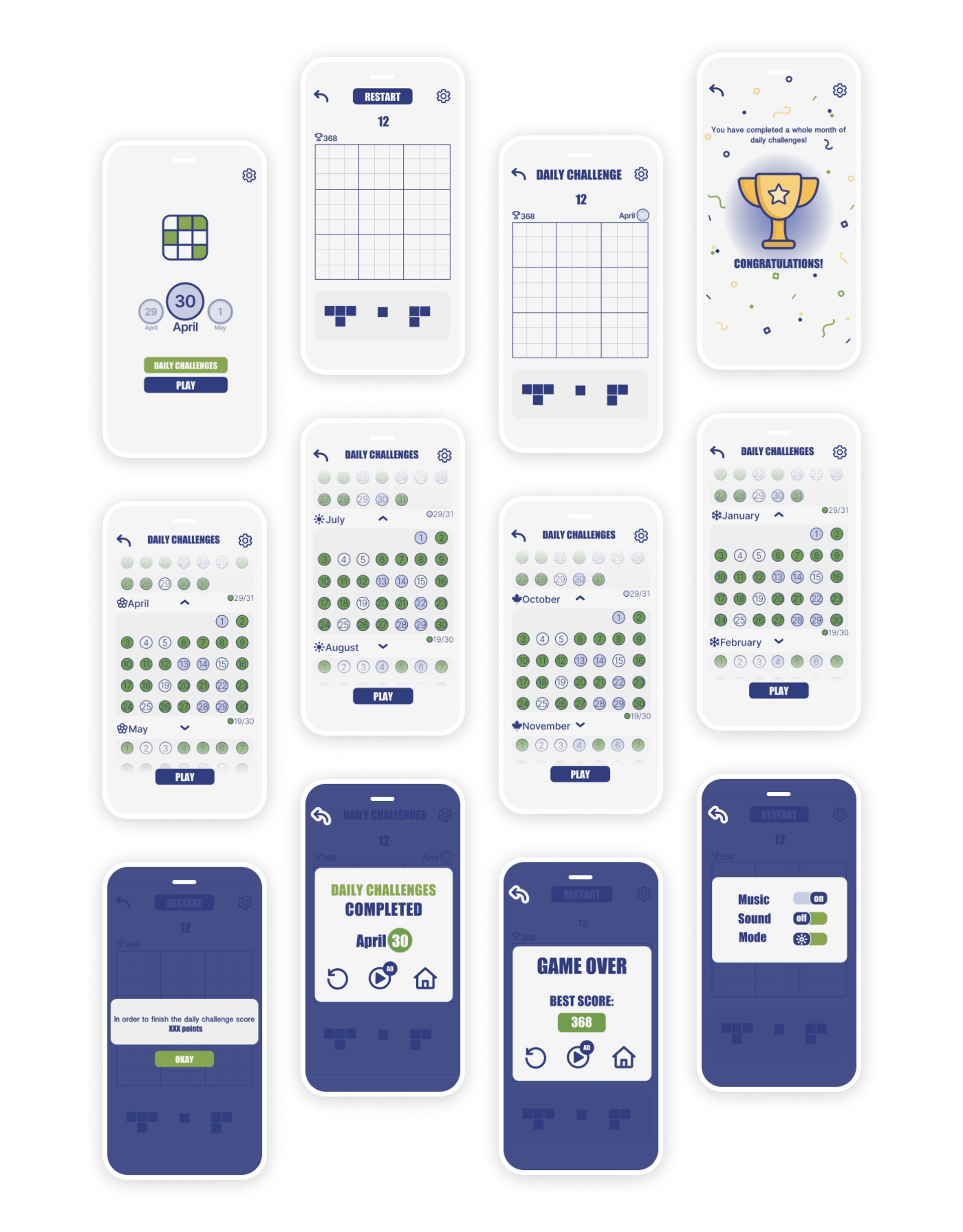
Defining the hybrid rule set: Tetris-style falling pieces must be placed on a 9x9 Sudoku grid without violating row, column, or box constraints. Pieces lock when valid; an invalid placement triggers visual feedback and loses a life.
Wireframing & Layout
Planning the game board proportions for mobile, positioning the HUD elements within thumb reach, and mapping the information hierarchy. The grid occupies 70% of the screen; everything else is peripheral.
Visual Design & Polish
Building the colour system, component library, and micro-interaction patterns in Figma. Smooth animations on piece placement, progress tracking, and a score multiplier system for completing multiple constraints at once.
Game Design
Mechanics that teach through play.
The game loop needed to be explainable in one sentence and learnable in under two minutes. Every mechanic decision was filtered through a single question: does this make the player feel smarter when they do it right?
The Core Loop
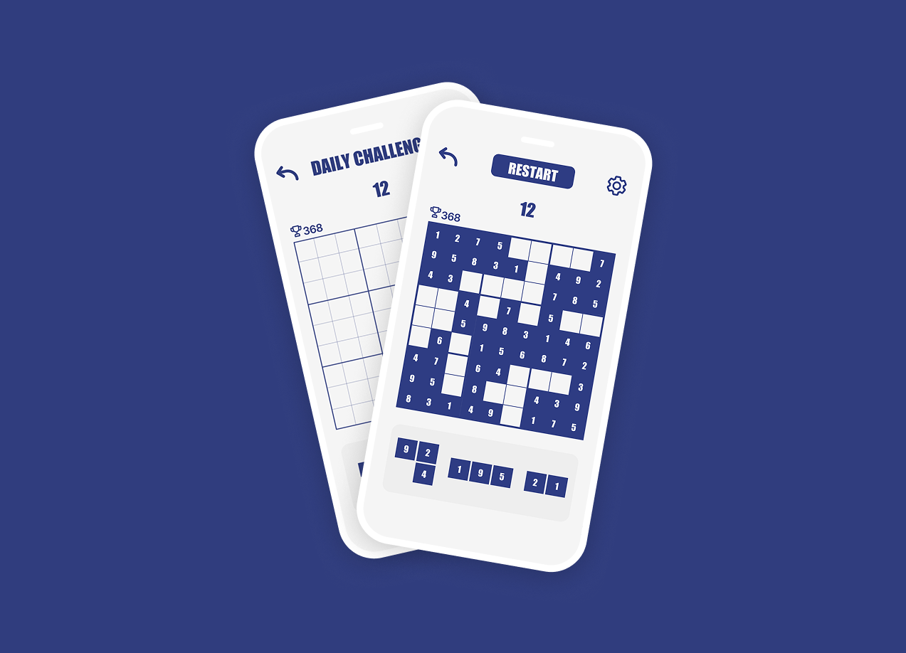
A numbered piece falls from the top of the grid. The player steers it into a valid cell - one that doesn't repeat a number in its row, column, or 3x3 box. A correct placement locks the piece in place with a satisfying snap animation. Complete a full row, column, or box to score.
Speed Scaling
Pieces start slow, giving new players time to think through Sudoku constraints. As the board fills, fall speed increases incrementally. The tension ramps naturally without changing the rules, turning a logic puzzle into a reflex test over time.
Visual Feedback
Invalid placements flash red and bounce back. Valid placements glow green and lock. Completed constraints animate with a sweep highlight. The entire ruleset is communicated through animation, never through tutorial popups.
Progress Tracking
A minimal HUD shows current score, lives remaining, and a completion ring for each Sudoku constraint group. Players can see at a glance how close they are to scoring without breaking their spatial reasoning flow.
Visual Design
Every colour choice has a reason.
Game interfaces demand a different kind of visual restraint than product UI. There's no onboarding screen, no help article, no second chance to explain the rules. The design has to communicate everything through color, motion, and spatial relationships alone.
Calm under pressure
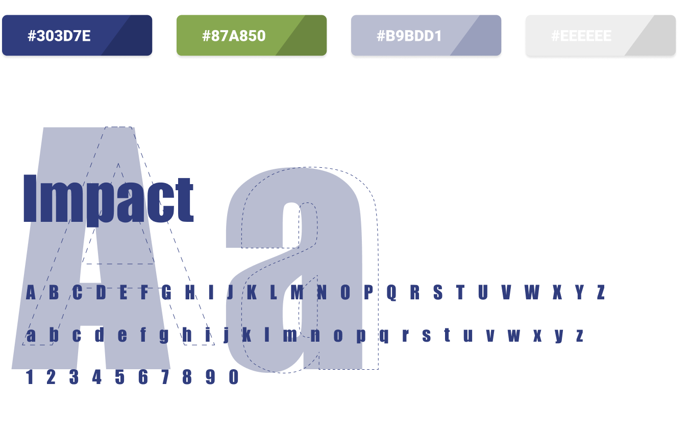
The deep blue grid (#303D7E) acts as a visual anchor. When pieces are falling fast and the player is under time pressure, the dark, saturated board keeps their eyes locked on the relevant cells rather than scanning the whole screen.
Reward through colour
Active and correctly placed pieces use the vibrant green (#87A850). The contrast against the blue board is immediate and unmistakable. Green means go, means correct, means you scored. Colour does the work of five lines of tutorial text.
Minimalism with purpose
Every interface element outside the game board is reduced to its functional minimum. Score is a single number. Lives are dots. Mode is a label. The player's attention is a finite resource - design does not compete for it.
Problem Solving
Three problems. Three fixes.
Hybrid game design surfaces problems that neither parent genre prepares you for. These are the three that took the most iterations to solve.
Problem
Numbers were unreadable at game speed
At 375px wide, a 9x9 grid gives each cell roughly 32px. Under Tetris-speed time pressure, players were misreading numbers — especially 6, 8, and 9 — and placing pieces in wrong cells, not from logic errors but from visual ones.
How I fixed it
I switched to Impact, which has extreme vertical contrast and near-zero ambiguity between similar glyphs at small sizes. The bold weight fills the cell without competing with the background. Every number became instantly scannable at any game speed.
Problem
The game felt like two separate experiences
Early playtest sessions returned the same note: it feels like Sudoku interrupted by Tetris. Players understood both halves but couldn't merge them mentally. The grid felt static; the falling piece felt foreign. Two grammars, not one.
How I fixed it
I removed all pre-filled starting numbers. Classic Sudoku gives you a partial grid to complete — Sudoku Tetris gives you a blank grid you build from scratch. Every number is player-placed. The board grows outward from your own choices, making the Tetris mechanic feel like authorship rather than interruption.
Problem
Teaching three constraint rules without a tutorial
A How to Play screen felt like an admission that the game was too complex. Players skip tutorials. But the hybrid rule set had real complexity: row constraints, column constraints, and 3x3 box constraints operating simultaneously during active gameplay.
How I fixed it
I translated every rule into a colour state. Navy = board structure. Green = valid placement. Red = invalid. White = empty. After two or three wrong placements, the colour grammar clicked without any text. Players learned the full constraint system through play, not reading.
Design System
Built for clarity at game speed.
The Sudoku Tetris design system is built around two principals: every element must be identifiable in under 200ms, and no color carries more than one meaning. Deep blue for structure, green for success, red for error - three rules, consistently applied across every screen.
Colour Palette
Typography
A B C D E F G H I J K L M N O P Q R S T U V W X Y Z
a b c d e f g h i j k l m n o p q r s t u v w x y z
1 2 3 4 5 6 7 8 9 0
Typeface
Impact (display) / System (UI)
Border Radius
6 / 8 / 12px
Spacing
4 · 8 · 12 · 16 · 24px
Style Layer
Flat + subtle depth shadows
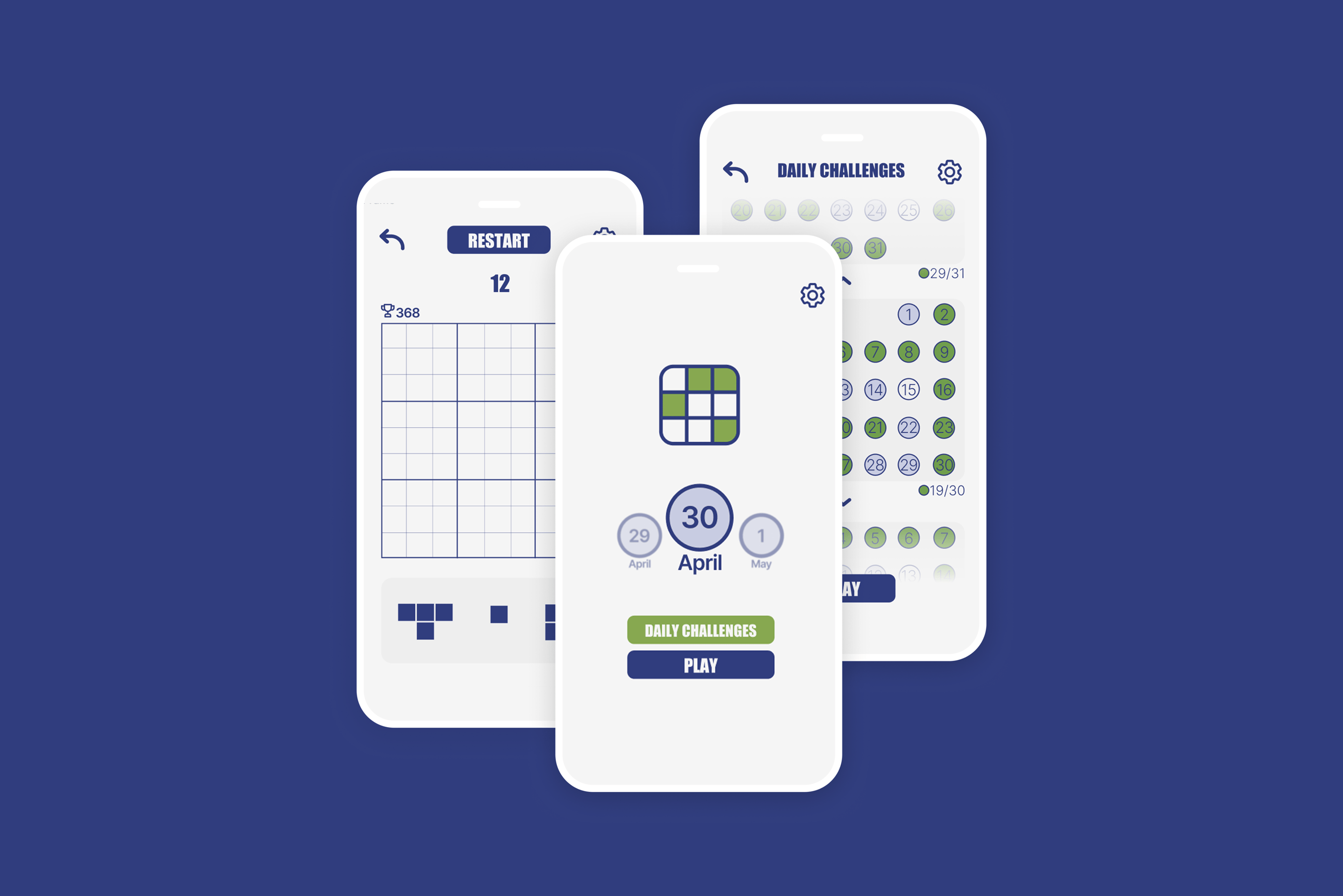
Final Screens
The full game, designed end-to-end.
The final screen set covers every state a player encounters: onboarding, gameplay, level transitions, score screens, and game over. Every screen was designed at 375x812px for iPhone SE and Pro dimensions, with thumb-zone ergonomics as the primary layout constraint.
Gameplay
Reflection
What this project taught me
Designing for focus
Game UI is the most unforgiving context for visual noise. Every element I added required justification not just for its utility but for whether it could coexist with the player's concentration. Removing things felt like progress. This project taught me that restraint is a skill, not an absence of ideas.
Colour as the only language
Without the ability to use onboarding popups or help text during play, colour became the primary communication tool. Defining a strict three-role colour system early - board, success, error - meant that every subsequent decision reinforced rather than confused the visual grammar. Rules created freedom.
Work with me
Got a game or creative app to design?
I design interactive and playful digital experiences from concept to pixel-perfect detail. If you have a creative product in mind, I'd love to hear about it.
Next project
04 - Interface Design
DailyUI Challenge